
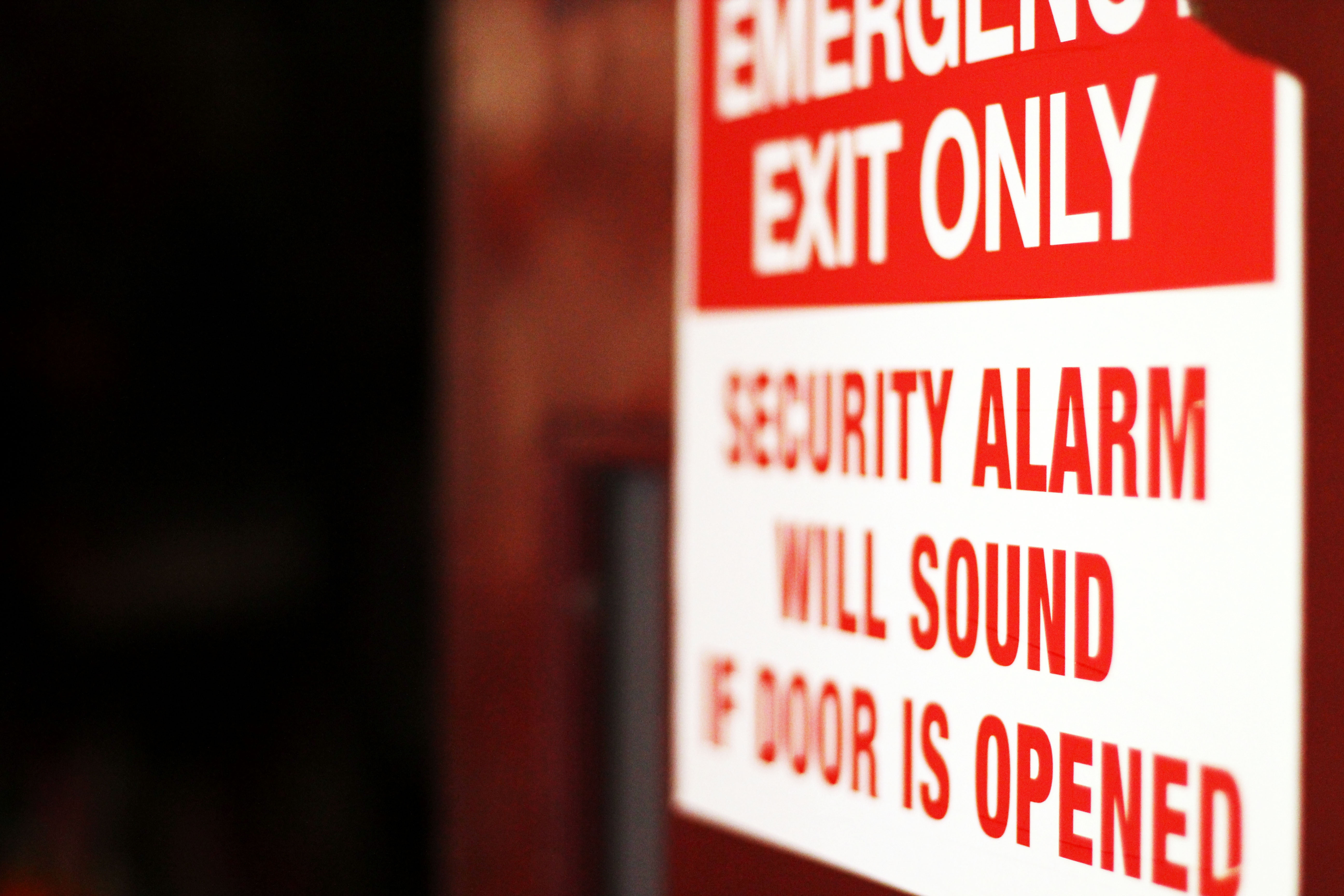
The example of Helvetica that I chose to use is a picture I took of an emergency exit sign located in the Museum of Fine Arts building. I believe the reason behind the designer’s decision of using Helvetica was to bluntly catch the reader’s attention. This is an “EMERGENCY EXIT” sign, which illustrates a caution. The letters need to be big and legible so that anyone can read and understand that this door should not be opened. The documentary mentions that businesses and corporations use the Helvetica typeface so they will look clean, efficient and professional. Although an emergency sign is not literally a corporation, its purpose needs to be prominent in some way to the reader. If any sign’s purpose is to warn people, the text needs to be smooth and not messy. There is no change in typeface as it would be distracting and force the reader to disregard the sign altogether. The text reading “EMERGENCY EXIT ONLY” is a little bigger than the text on the bottom, but it does not overpower the text at the same time. As far as the scale of the typeface, it is pretty consistent throughout. The letters in this typeface seem almost numerical; child-like if you will. The contrast of the red and white bring the reader’s attention to the top of the sign first, which has the important text. Overall, it is a simple illustrated example of the Helvetica typeface. There are no serifs, which makes this example clear cut and bold.
TimWhitePhotography
Museum of Fine Art
Washington State University
Pullman, WA
