
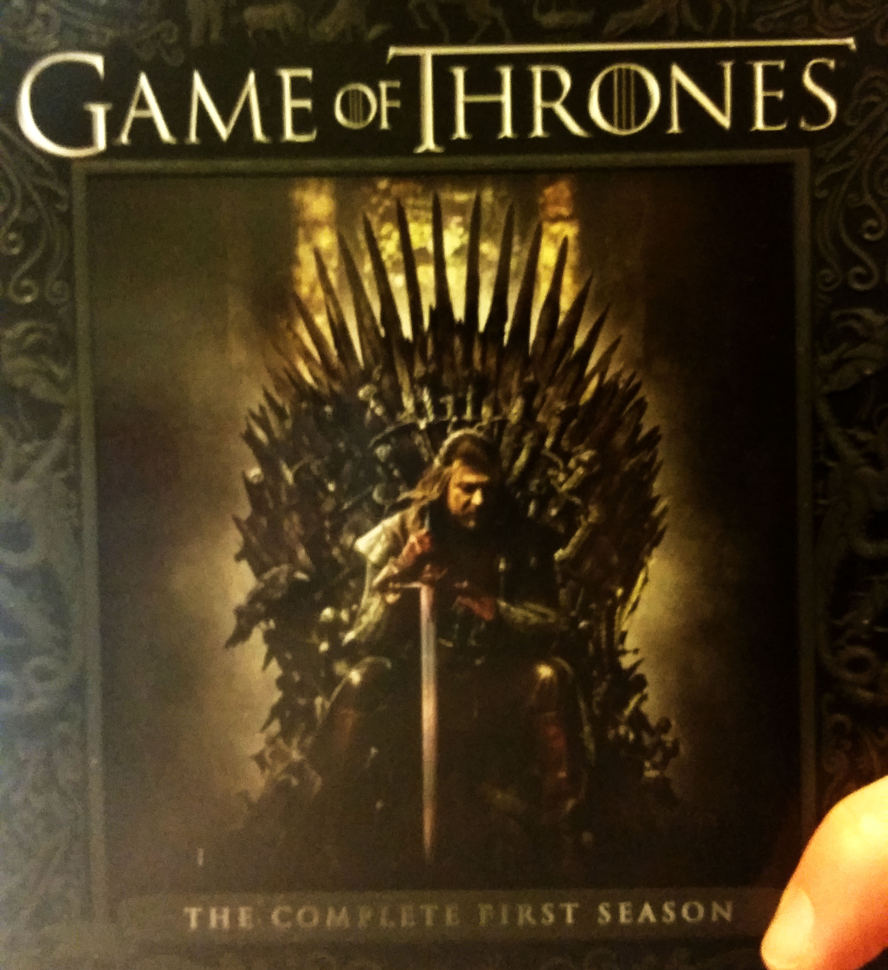
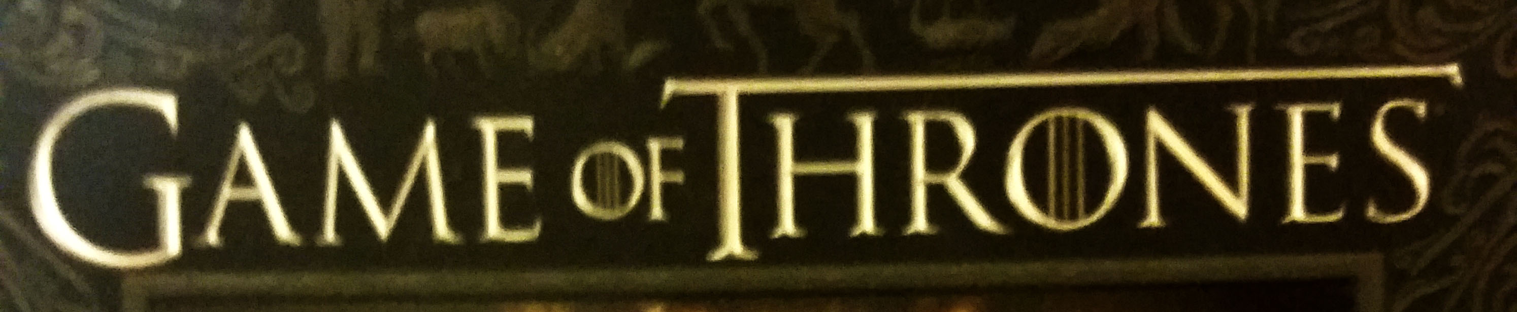
I chose the title on the season one box set for Game of Thrones. The title is successful in many ways, it eludes to what the TV show is about by textually portraying strength, ancient characteristics, and elegance.
The title shows a sense of strength by using traditional small uppercase letters throughout the title and similar uppercase letters for the words “Game” and “Thrones.” At first glance the title may seem analogous in terms of caps, but with a second look one notices that the cap height of the “G” in “Game” and the “T” in “Thrones” are a few points larger, and they also extend below the baseline differentiating between the upper and lower case while keeping a sense of boldness in the title. Steadiness is also shown through the small uppercase placement on the baseline, it appears as though even the bowl of the curved letters do not dip below the baseline but sit on top of it.
The elegance involved in the HBO TV series is an important factor to play into the text since the characters in the show are all some form of royalty. This nobility exudes through the delicacy of the cross bars. If the cross bars were left more bold in comparison to the stems, the words would appear more masculine and less ornate.
Another important factor in creating an old-fashioned title is the serifs that are present. Since people have come to recognize fonts sans serif as modern, those texts with serifs have become synonymous with old-fashioned, or outdated. Since Game of Thrones is supposed to be in a different time, including the serif was an appopriate choice. The sharp shape to the serifs paired with the elongated terminal on the “T” appears to take the shape of a sword, which is a common weapon used throughout the series.
All these choices, serifs, crossbars, stems, small uppercase and terminals, come together to create an appropriate typeface for the “Game of Thrones” box cover.
