
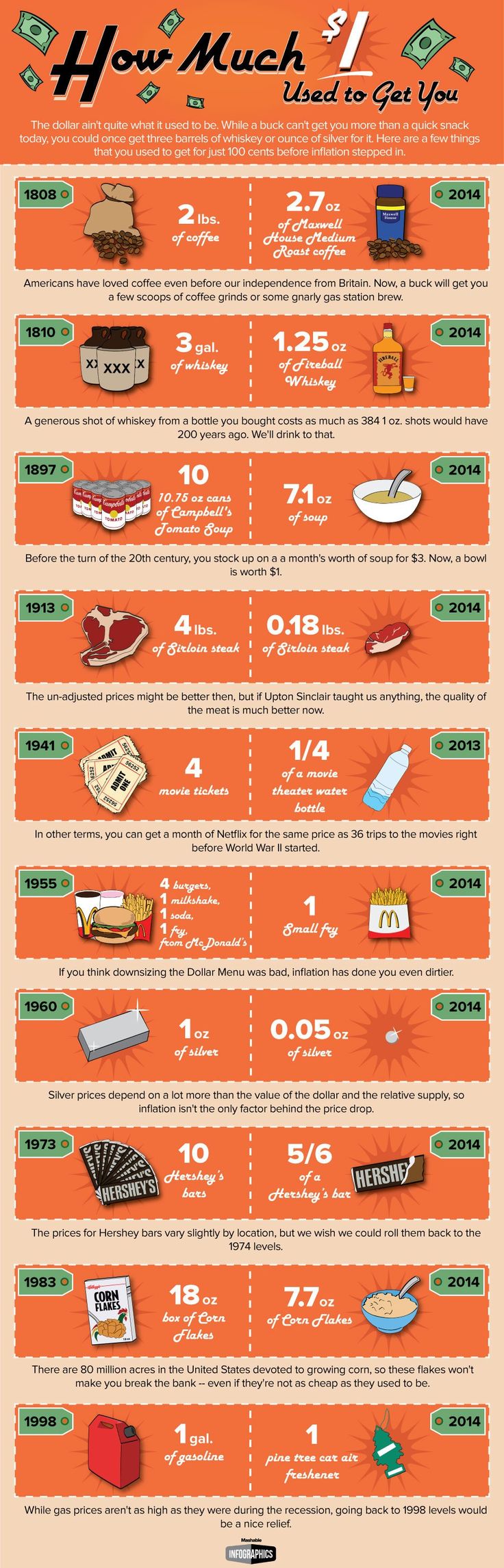
How Much 1$ Used to Get You
This graph used to describe the difference in the buying power of a dollar in the past vs. the present, has both successful data representation of small/multiples and also some not so successful representation of the data. While this example from pinterest is text-heavy, the small multiples are still apparent throughout the infographic. The most obvious small/multiples being represented are the orange boxes that are “cut” in half to compare the past years and the present years, and the repeated price tag-looking signs that state the year that is being examined.
As Tufte claimed, the small contrasting color used for the green price tag draws attention to the different years, which is an important aspect of this graph because it is one of the two consistent variables that is being tracked.
However, the size and most importantly, the length of the infographic as a whole cause problems with its success, if only in certain situations. For example, Tufte claims that to be a successful comparison, the map must be viewable within the scope of the eye span. So, if this image were printed or viewed on a very large screen instead of viewed via my 15-inch computer, the comparisons would be deemed successful.
The white dashed line used to separate the past and present comparisons is small enough not to be distracting from the information. Also, the star shape images behind each visualization of items for a dollar was a nice way to enhance the multiples being viewed.
Another issue I have with this depiction of small multiples is the separation tactics. The two columns, left being the past and the right being the present, could have used the silent method to display the changes. The text in the margins should have been left out (it is superfluous anyways), and the space separating each row could have been reduced using the silent method of separation. Then the eye would respond to the graph better and could be viewed smaller or at a further distance thus, better displaying the “change in data, not changes in data frames.”
