
Digital Comics Collage
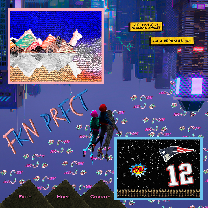
In this post, I pay homage to my inspirations through digitizing physical materials and curating graphic art in a Digital Comics Collage. Clothing brands, sports teams, musicians, and movies are all inspirations of mine that are present in this collage. The images of these influences are not alone, however, as they are all connected to each other and to words to create one coherent product. I think that Scott McCloud would agree that this collage fits under his definition of comics, as the two panels are juxtaposed not only to each other, but the city skyline background as well. In addition, this fits the definition because these graphics are all intended to “produce an aesthetic response in the viewer.” Utilizing concepts like balance, color contrast, and direction from John Lovett’s Design Overview helps to keep the comic visually interesting and to define layers and flow. Balancing this collage are the two panels boarded by pink and blue in the top left and bottom right, respectively. This allows the viewer to give their attention to the comic in a way they naturally would, rather than having their attention be pulled to the blue panel if the pink panel wasn’t there.
As far as making the composition of these materials and images mean something, they each in someway inspire or have inspired me. One of the heavy influences for this collage is the movie Spider-Man: Into the Spider-Verse, which I talked about briefly before in my digital comic. It contributes to the comic collage through a couple quotes, the background, the character at the center of the page, and the colorful “glitched” clouds. In addition, at the bottom of the blue panel, there is a row of small Oscar Award-like figures. That figure is from the cover of the album DiCaprio 2 by JID, which is what I listened to for most of the time I created this project. The words in this comic that stand out to me are the two yellow dialogue boxes because of how they feel to me as a viewer. Because these boxes are not constrained to a panel, it allows the words to live in the city skyline and take up more “space” in the viewer. The words feel alive this way, like the character is yelling as they are falling up the page.
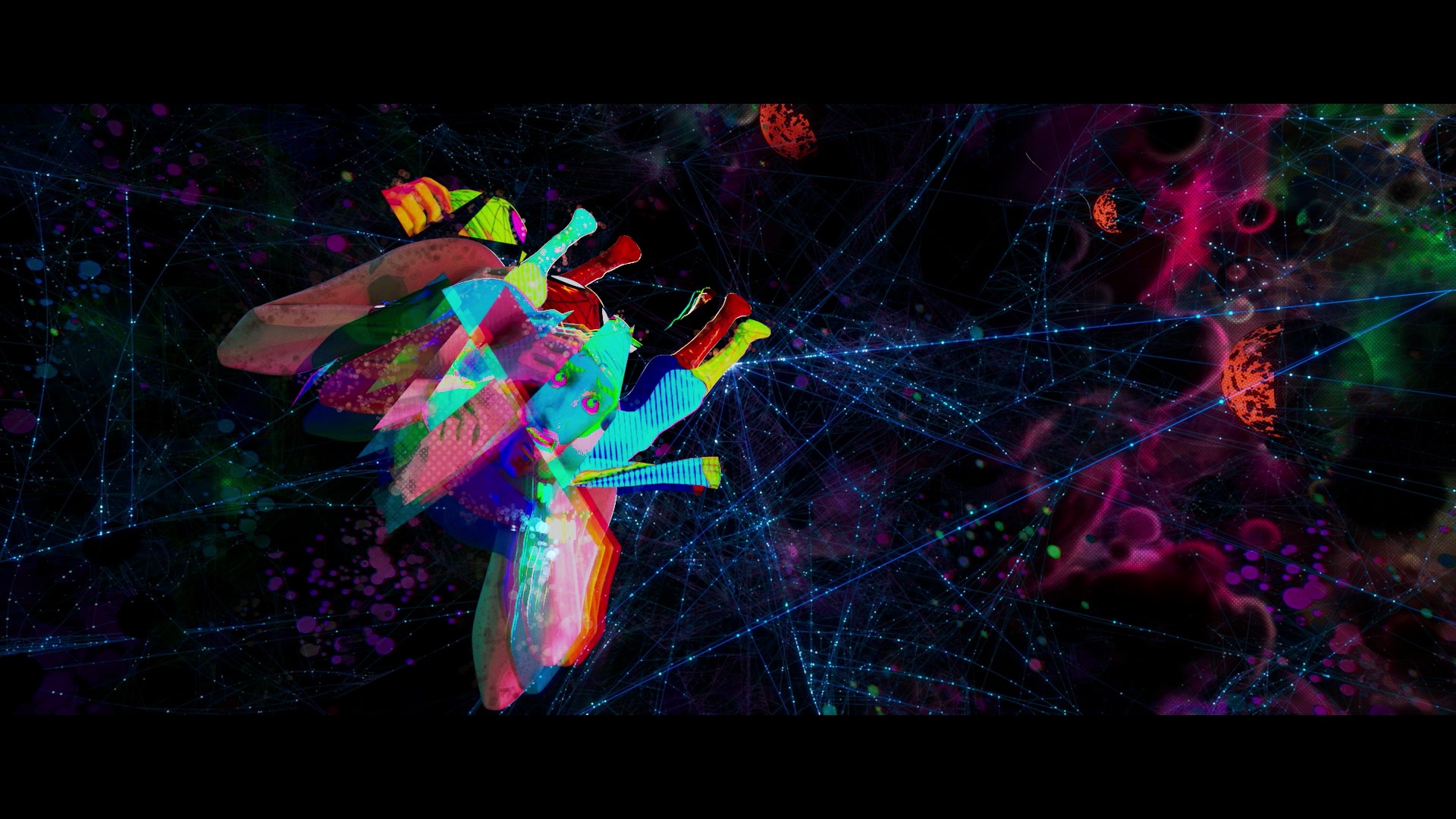
Screenshot from Spider-Man: Into the Spider-Verse showing Spider-Man “glitching”
Creating this Digital Comics Collage was the first time that I had sued Adobe Photoshop since about 2012 when I was in 6th grade, but I feel as though I have been able to adapt to it quickly. The tutorials in general were a big help because it took things very step-by-step and it was east to follow. As expected, I had to make many selections, but I think one of things that was more important than I thought was being able to layer things effectively. Fortunately, I think I did a good job of figuring out the nuances of those mechanics. Overall, I really enjoyed creating this poster, especially in a digital environment. One of the main advantages of creating in a digital environment is that you have more freedom to try things that may otherwise seems too hard or too risky to try with physical creations. For example, I was able to adjust the hue and saturation of the clouds in the background to make an Into the Spider-Verse reference. That reference is that the “glitched” clouds are influenced by when Spider-Man “glitches” in the movie creating a similar feel. All in all, I am very please with the finished product of my Digital Comics Collage.
