
My Comic Collage is definitely more traditional comic made out of real life materials to create the collage part of its name. In terms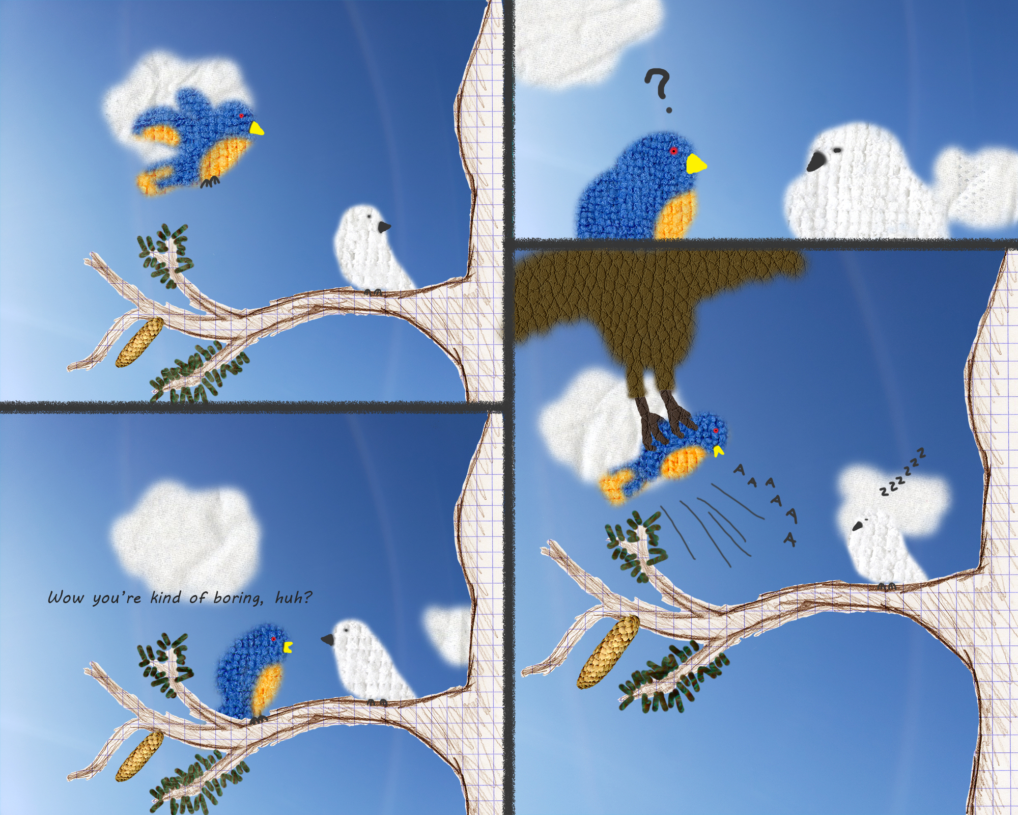 of fitting McCloud’s definition of a comic, “Juxtaposed pictorial and other images in a deliberate sequence, intended to convey information and/or to produce and aesthetic response in the viewer.” I feel as though I fit his description perfectly. My comic uses panels (being the different images) in a sequence close together to convey a story aesthetically. I feel McCloud’s definition was pretty broad in and of itself so It was pretty likely that most projects will fit his definition, mine might just be a little more obvious than some of the more abstract collages. When I was working on the panels I was thinking about some of John Lovett’s Design Overview to think about the composition. I thought about elements such as lines, texture, color, and direction. The two smaller birds both use the same textures the different colored washcloths I bought in a pack, while the large bird uses a rougher texture I acquired from the cover of a book. I tweaked the color of the book cover on different parts of the large bird for a more varied look, and I tweaked the color of the drawn tree to be brown rather than black. For lines and direction I used oblique lines to show the movement of the colorful bird being taken by the larger bird. For principles I thought about the balance of the panels to try and draw the reader through the correct reading sequence like keeping the two main birds near the center of the panels to try and not draw attention to the wrong panels on accident. When it comes to why I made a more traditional comic for this Comic Collage, it’s simply because I had difficulty finding more that just simple colored textures to scan. I finally settled on using the color and textures from the collected materials I could acquire to create objects using them rather than straight up use the scanned objects themselves, exceptions being the pine cone and tree I drew on graph paper. When it came to the text I tried to make something lighthearted and have the font fit my intentions. The colorful birds font for speech is clean and easy to understand, but doesn’t look formal. While the question mark, the scream, and the zzz’s are all drawn by the mouse to keep them loose and (hopefully) fun. This is my first project using Photoshop so learning how to use the tools was enjoyable particularly mixing clipping masks and layer masks for the colorful bird. I used a lot of clipping masks for the clouds, birds, and pine needles. I enjoyed working digitally and I want to get better at it.
OFFICE HOURS
Tues and Thurs, 4:05-5:00pm, Avery 479 (office) or Avery 105 (lab)
EMAIL: kristin.carlson@wsu.edu for an appointment
Blog Posts
- 201 Blog
- Archives
- Fall 2014 Archive (336)
- Fall 2014 Archive (338)
- Fall 2015 Archive (336)
- Fall 2015 Archive (338)
- Fall 2016 Archive (336)
- Fall 2017 Archive (336)
- Fall 2017 Archive (336)
- Fall 2018 Archive (201)
- Fall 2018 Archive (336)
- Fall 2019 Archive (201 Blog)
- Spring 2016 Archive (336)
- Spring 2017 Archive (336)
- Spring 2018 Archive (336)
- Sample Posts by Students
- Sample Posts by Your Professor
- Uncategorized
