
 I believe that my comic does fit into McCloud’s definition: “Juxtaposed pictorial and other images in deliberate sequence, intended to convey information and/or to produce an aesthetic response in the viewer”. I believe this because my comic is a sequence of items close to me and that conveys information about me to the viewer. John Lovett’s Design Overview helped me by helping me to understand terms like repetition and harmony. I feel like my comic is a good example of repetition considering that I have a comfortable amount of the food in the background to admire. Regarding harmony, the items in the background are all foods/related elements. The only linguistic elements that i’d highlight in my comic is my name tag at the top. I feel like that stands out really well and is effective in letting the viewer know my name and what school I attend.
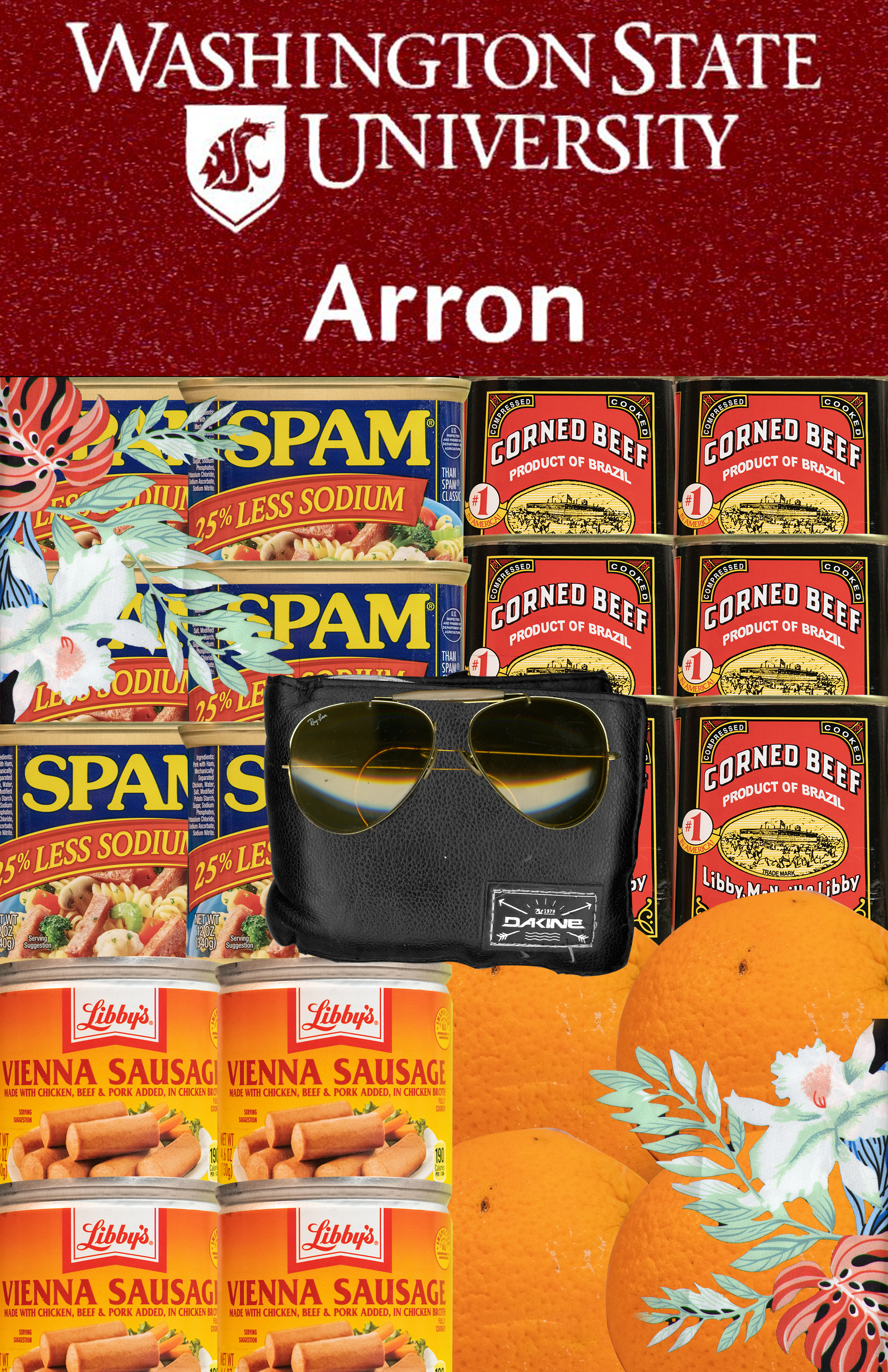
The reason for my wallet being in the middle is because it resembles my money and the items in the back are what most of my money goes to, which is food. The shades on top of my wallet is just a touch of me to add my character to the comic. It is one of my most favorite pieces of eyewear. The floral items on the corners of my comic resembles where I come from, which is Hawaii. This piece comes from one of my floral collared shirts.
This is not my first time using Photoshop. I have been using Photoshop for about a year. I have learned more about layer masks like how to select certain parts of a photo and using the brush tool to make those certain parts disappear. I’d say that the most useful technique is layer masking. I actually love composing in a digital environment because all the tools I need is literally in the program that I am using.
