
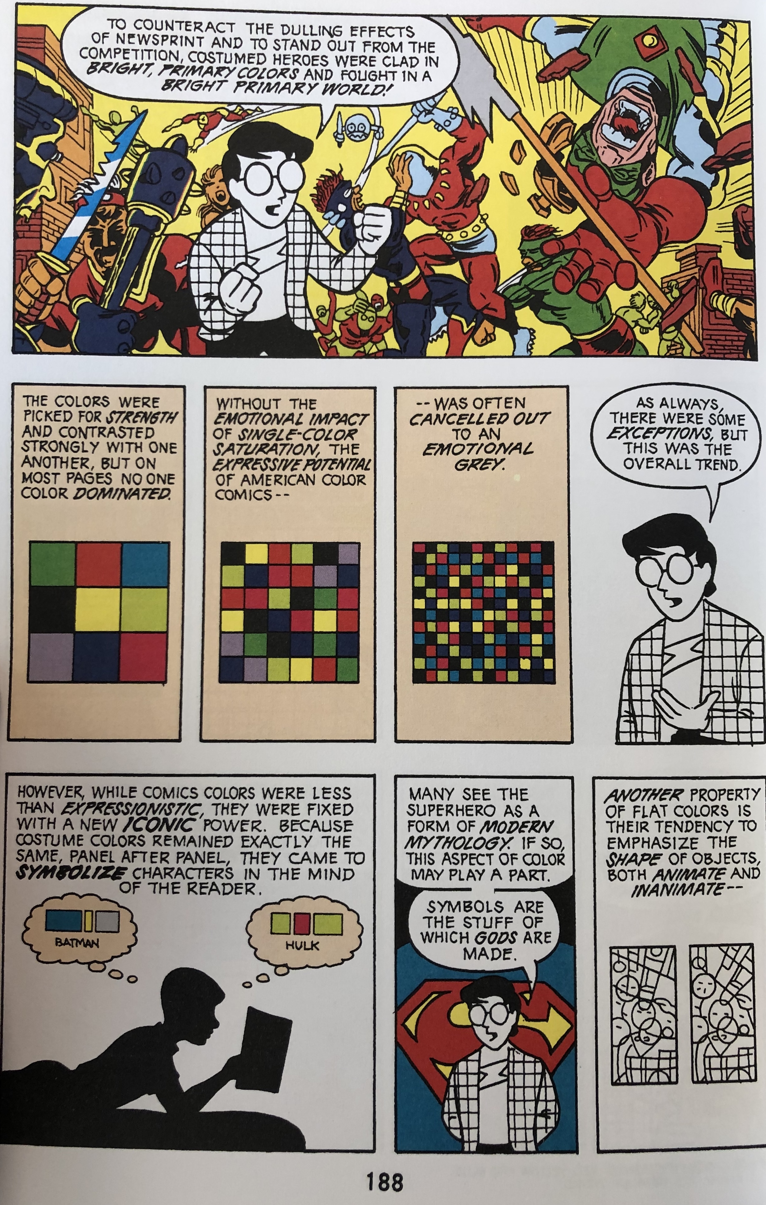
 I chose the 188th page in Scott McCloud’s “Understanding Comics” because of the intense use of color in the “window” on the very top of the page. I believe that McCloud’s layout is effective in using shape, direction, and texture. Regarding shape, Lovett stated that a shape is “a self contained defined area of geometric or organic form.” In the middle parts of this page, there are three cubes, each with a different amount of squares in them. Taking that Lovett stated that a shape is an area of geometric form, the example in McCloud’s layout takes this literally in making actual geometric shapes (squares). The upper “window” shows great movement. Lovett stated that vertical movement suggests balance, horizontal movement suggests calmness, and oblique movement suggests movement and action. McCloud’s layout is a great example of oblique movement, seeing that it’s not exactly horizontal nor vertical movement, but a little all over the place/diagonal (oblique). Texture also plays role into this because there is surface quality on the red glove of the figure to the right in the “window” on the top. The lines on the glove suggest that the glove is smooth, but in movement because there’s a sense of retracting or bending on the glove.
 OFFICE HOURS
Tues and Thurs, 4:05-5:00pm, Avery 479 (office) or Avery 105 (lab)
EMAIL: kristin.carlson@wsu.edu for an appointment
Blog Posts
- 201 Blog
- Archives
- Fall 2014 Archive (336)
- Fall 2014 Archive (338)
- Fall 2015 Archive (336)
- Fall 2015 Archive (338)
- Fall 2016 Archive (336)
- Fall 2017 Archive (336)
- Fall 2017 Archive (336)
- Fall 2018 Archive (201)
- Fall 2018 Archive (336)
- Fall 2019 Archive (201 Blog)
- Spring 2016 Archive (336)
- Spring 2017 Archive (336)
- Spring 2018 Archive (336)
- Sample Posts by Students
- Sample Posts by Your Professor
- Uncategorized
Design Elements and Principles: Arron Borja
This entry was posted in Fall 2019 Archive (201 Blog). Bookmark the permalink.
