by Robert Rauschenberg
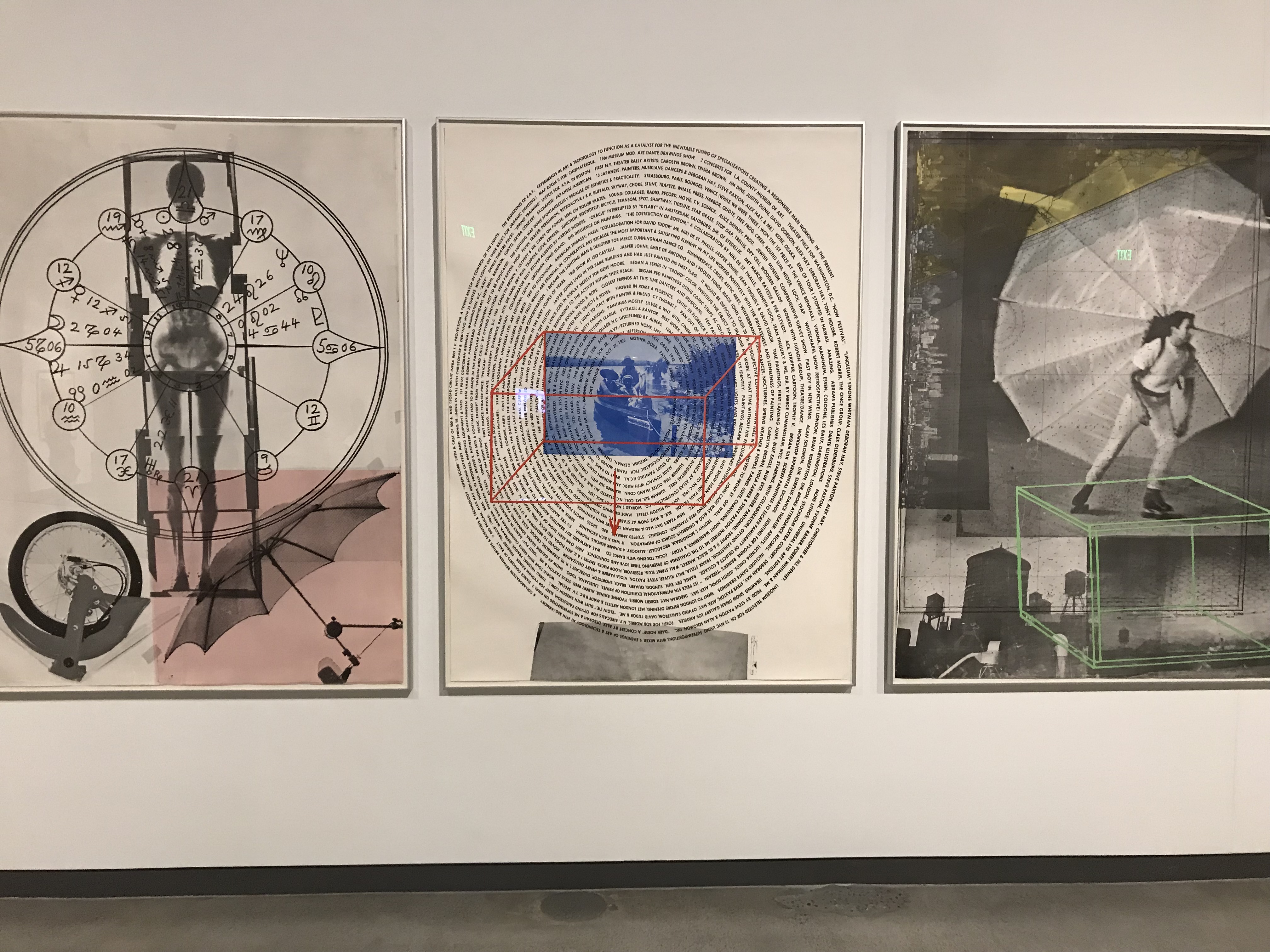
I think this is an interesting and relevant example for me because the picture uses a typeface that is sim ilar to mine in the sense that it has a constant x-height for every letter. This is also an interesting piece because the way the words are wrapped around in a spiral pattern, starting form the middle and working its way around and out, is very interesting to look at. I also like this image because it is one of three in a set, and each one of the images in a set are different images of the artists life, showing off things in his life and things about him. One thing that was very interesting about this image was the face that there is a 3D box in the middle of the image that does not seem to have any meaning or reason for it being there. Also the fact that the words are an autobiography of the artist, and it starts with where he was born in the middle and as he grew up and matured, it is described as the words go around the spiral. This is also an interesting picture because the image from a distance, looks like a fingerprint, symbolizing the autobiography because just like a fingerprint, the words represent him. Some things about this image that will influence how I create my typeface are that the words don’t have bold stems and spines, but are all consistent, and that is how I want my typeface to look like, where it is simple and easy to read, and also clean and consistent. What I like about this typeface is that all the letters are capitalized, making it so no particular words stand out and seem more important than others.