
Pattern Design from Creative Market
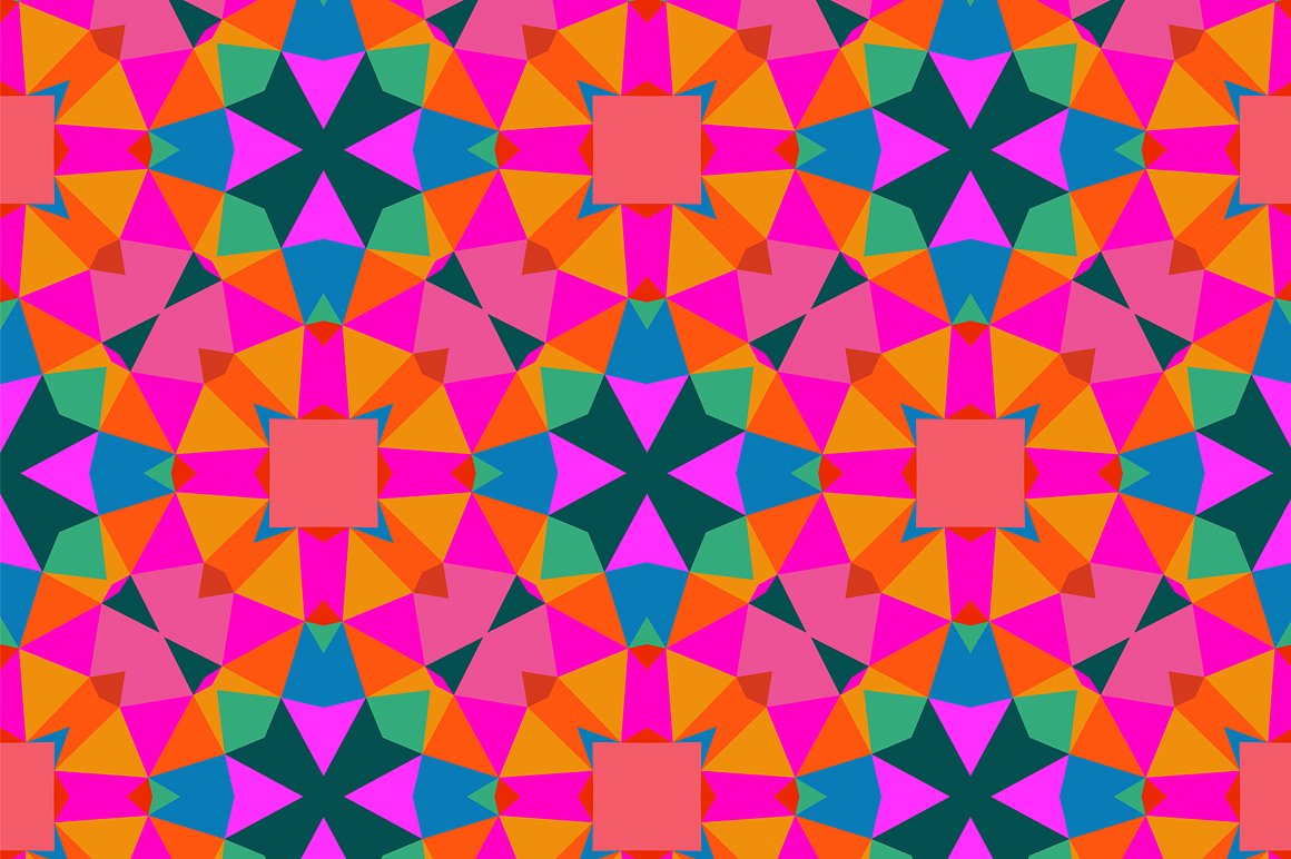
This pattern is a geometric pattern with lots of bright hues. I would describe this pattern as very exciting and bright. The dark blue stands out aginst the brighter oranges and pinks. The contrast between the dark versus bright brings my attention to the darker blue. The colors in the pattern becomes more saturated when the same hue overlap. The darker pink is like a more saturated version of the lighter pink and the darker orange is like a more saturated version of the lighter orange. The pink and orange is also a warm temperature color whereas the blue is a cool color. This makes the contrast even greater between the two colors. There is an analogous color interaction between the pink and the orange, as they are near each other on the color wheel. There is a complementary color interaction between the orange and the blue as they are on opposite sides of thw color wheel. This makes the colors stand out against each other even more. The high saturation of all the colors lends to more contrast between the two hues in the pattern.
