
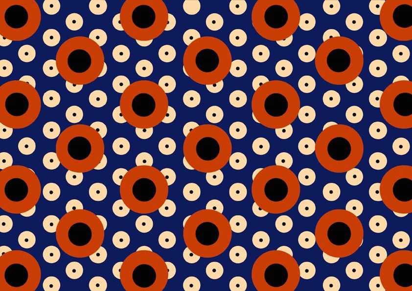
This pattern caught my eye because of the shapes, the contrast of colors and the general layout of the pattern. Within this pattern, the one color that contrasts the other colors is the bright red that outlines the circles. I think that the red is used mainly to diminish the tan-ish color that is in the shape of a smaller circle. I also think that the bright red is used to intensify the black inside of the red. In the photo, it appears that there are two different layers of the pattern. The bottom layer is the navy color with the tan circles, and the top layer is the black and red circle. The hue of the pattern seems to be more on the dark side rather than bright. The colors in this pattern are complementary with the shade of blue, red, and kind of a shade of yellow with the tan color. I think figure/ground plays a huge role in the color interaction. The blue and tan colors seem to be interacting with each other, and the black and red colors seem to be interacting with each other.
OFFICE HOURS
Tues and Thurs, 4:05-5:00pm, Avery 479 (office) or Avery 105 (lab)
EMAIL: kristin.carlson@wsu.edu for an appointment
Blog Posts
- 201 Blog
- Archives
- Fall 2014 Archive (336)
- Fall 2014 Archive (338)
- Fall 2015 Archive (336)
- Fall 2015 Archive (338)
- Fall 2016 Archive (336)
- Fall 2017 Archive (336)
- Fall 2017 Archive (336)
- Fall 2018 Archive (201)
- Fall 2018 Archive (336)
- Fall 2019 Archive (201 Blog)
- Spring 2016 Archive (336)
- Spring 2017 Archive (336)
- Spring 2018 Archive (336)
- Sample Posts by Students
- Sample Posts by Your Professor
- Uncategorized
