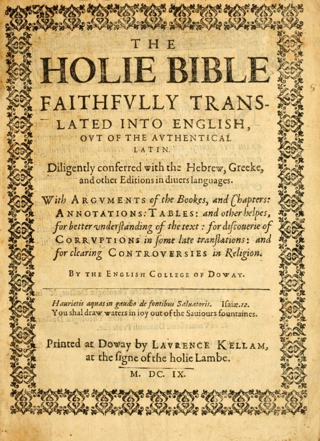
Every time I start to look at fonts, I realize there are always more to a font than initially meets the eye. Once you understand the concept we talked about in class how “typefaces are a form of art and that letters are socially excepted pictures meant to represent our language” you start to understand and appreciate typefaces more.

Title page of the Old Testament, Tome 1 (1609) of
The Holy Bible-Douay Rheims Version (https://en.wikipedia.org/wiki/Douay–Rheims_Bible)
When I first started looking at this type I noticed that it was a serif type and that it had consistency but then as I looked deeper I also notices discrepancies between different parts of the page. The one consistency through the whole page is obviously the Baseline for the text. Usually the cap height for the text is consistent and it is in the top and bottom parts of the page but in the middle of the page they utilize small capitals with regular capitals. I think this adds a nice variation to the text. Another strange thing that they did was in the middle of the page they gave the capital letter C a descender below the base line, which I have never seen before. Something else that I noticed was this text had narrow crossbars and thicker spines.
