
This is from the book Hvg. Grotii Batavi Syntagma Arateorvm: Opvs antiqvitatis et astronomiae stvdiosis vtilissimvm written by Solensis Aratus
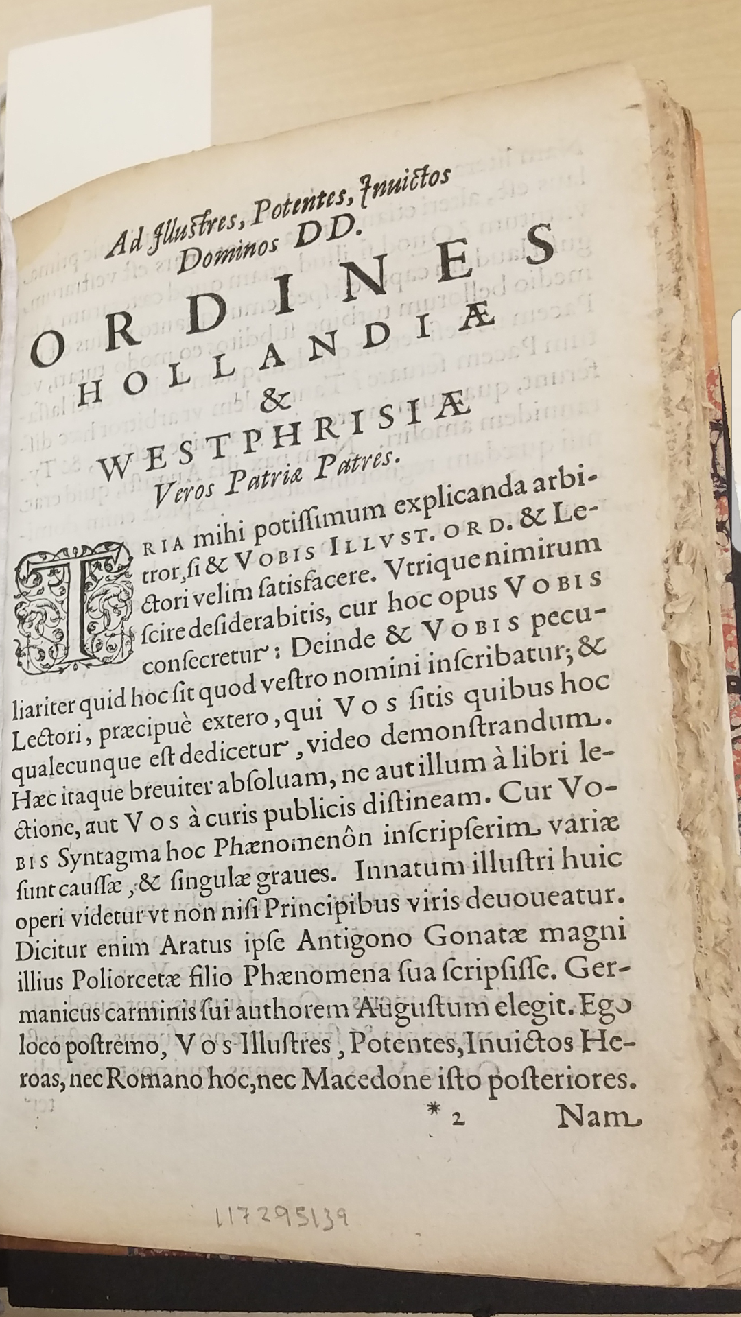
The one piece of typeface that stood out to me during our visit to the museum was one within Hvg. Grotii Batavi Syntagma Arateorvm: Opvs antiqvitatis et astronomiae stvdiosis vtilissimvm written by Solensis Aratus. This book, which was not in English, was about phenomena and diosemeia in Greek mythology. This book which is a manuscript shows very nicely hand-written lettering and has a lot of elements of typeface that were disused In our reading.
One thing that stands out right away is the ornaments on the beginning letter of each chapter. When I saw this I thought about the reading and how it says that ornaments are designs and patterns that interact with the letters. So, when I saw the “T” at the beginning of the chapter I knew that that’s what the reading was referring to. Another thing that I noticed about the anatomy of the letters within the text is that it is written in a serif style typeface, which can be seen by looking at the ends of each letter and how they have a sort of decorative look to them. This text also used bold capital lettering in its titles and even what seems like small capitals as a subtitle to the chapter. It also mixes typefaces and used bolds and italics, especially in the title. One last thing I noticed is at the beginning of new sentences the letters are not only capitalized but bolded as well.
Overall this typeface is definitely like the humanist and old styled lettering that was brought up in the reading. Not only because it was written in the 1500’s which is when a lot of printers were playing around with typefaces and beginning to put names to them but because of its basic anatomy.
