This image was found on Pattern Foundry, which I found through the Resources tab on the class website. It is called Amources and is created by Thomas Brinkmann.

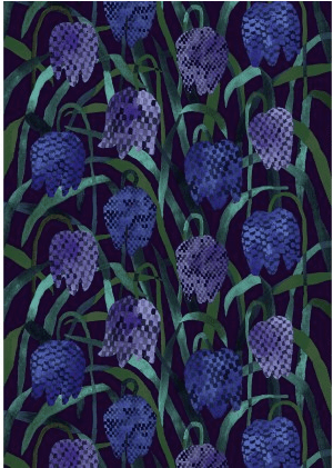
This image is from Marimekko Textiles, which I found through the Resources tab on the class website. It is a Gerda HW cotton sateen fabric and is sold on the Marimekko website.
I chose to analyze these two patterns. The one with the orange flower- like elements represents a more geometric pattern. The flower element that is repeated is made up of regular circles repeatedly circling another regular circle, which creates a symmetrical element. It is clear that the flower is created by a computer because all of the circles are exactly the same size, making the element regular and geometric. This pattern utilizes one isolated element with the same amount of space between each repeated element. This creates a grid because of the uniformity of the flowers, which then creates a larger texture. Color is utilized very conservatively because each element is the same color and the entire background is white. The orange flowers contrast against the white background, making the elements stand out. The orange has a dark value, while the white has a very light value, which also creates the contrast and has the viewer concentrate solely on the repeated flowers. By the artist only choosing to include two colors, it causes the viewer to appreciate the simplicity and uniformity of the pattern. Figure- ground relationship has a lot to do with pattern design because the color of the background can either take away or highlight the elements included in the pattern. In this case, the white background highlights the orange elements because the orange has much more value and stands out against white.
The image of the purple and blue flowers is my example of an organic pattern. The elements are the flowers, which include green stems. The flower and the stem are irregular and not one is the same shape. There are no straight angles, but there are curves that create a soft texture. The flowers are more representative of a real life picture because the elements show irregularity between each one. The elements are still repeated over and over again making a pattern, even though there is overlapping and irregular spacing between them. The repeated principle is a purplish flower with a green stem. Color is used very creatively. The petals are made up of irregularly shaped squares that are different colors, creating texture within the petals. The colors are different shades of purple, sometimes perceiving a blue color because the shade’s value is so dark. Purple and blue are right next to each other on the color wheel, therefore harmony is achieved and the mood of the elements is unified. The colors of the stems are different shades of green, sometimes more luminance than the other. This design choice creates a shadow effect that also creates the illusion that the stems are bending over each other. The black background contrasts against the green and purple just enough to highlight the bright parts of the stems and not take away from the elements themselves.
