
“intellectstudiospromo”
http://designdevbits.com/typography-point-poster-designs/
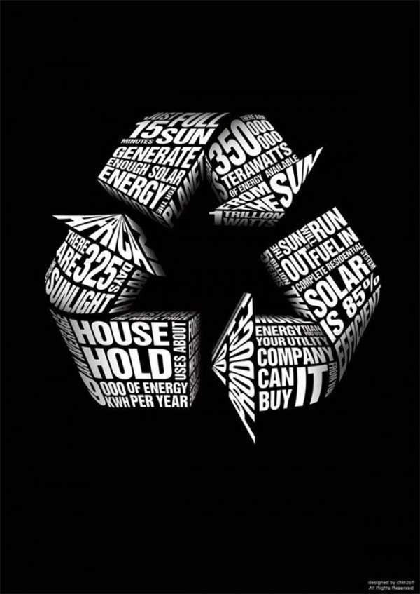
This poster is working with the STABLE FIGURE/GROUND relationship. If a viewer is looking at the overall picture the recycling logo it is almost at the center and it stands out from the black BACKGROUND. The letters that create the recycling logo play with the NEGATIVE SPACE around them . The POSITIVE SPACE ( which are the letters) holds the information about energy and sunlight for the reader. The letters were specifically designed or FRAMED to be arrows so it would grab attention. The information creates a FRAME of a triangle in the center of the logo that seems to be sinking into the poster that allows the logo to be visible. The poster doesn’t have any type of MARGINS OR FRAMES around the edges of the paper so it BLEEDS off the page. The words on the poster are playing with the HIERARACHY and SCALE. The words “house hold”,” sun”,” solar” and “it” were scaled bigger for importance and to be key words about what the poster might be about. The same type of HIERARACHY was given to the numbers “325”,”15″,”350″ and ” 85%”. This image seems to be 3-D since the words were curved , stretched , and given a disappearing texture to make parts of the logo seem to pop out of the page or move towards the viewer. The information about how much energy we use was given same importance as the over all image so the text wouldn’t disappear. The lines at the bottom right of the image was scaled to a smaller size so the informational image text was the focal point.
