
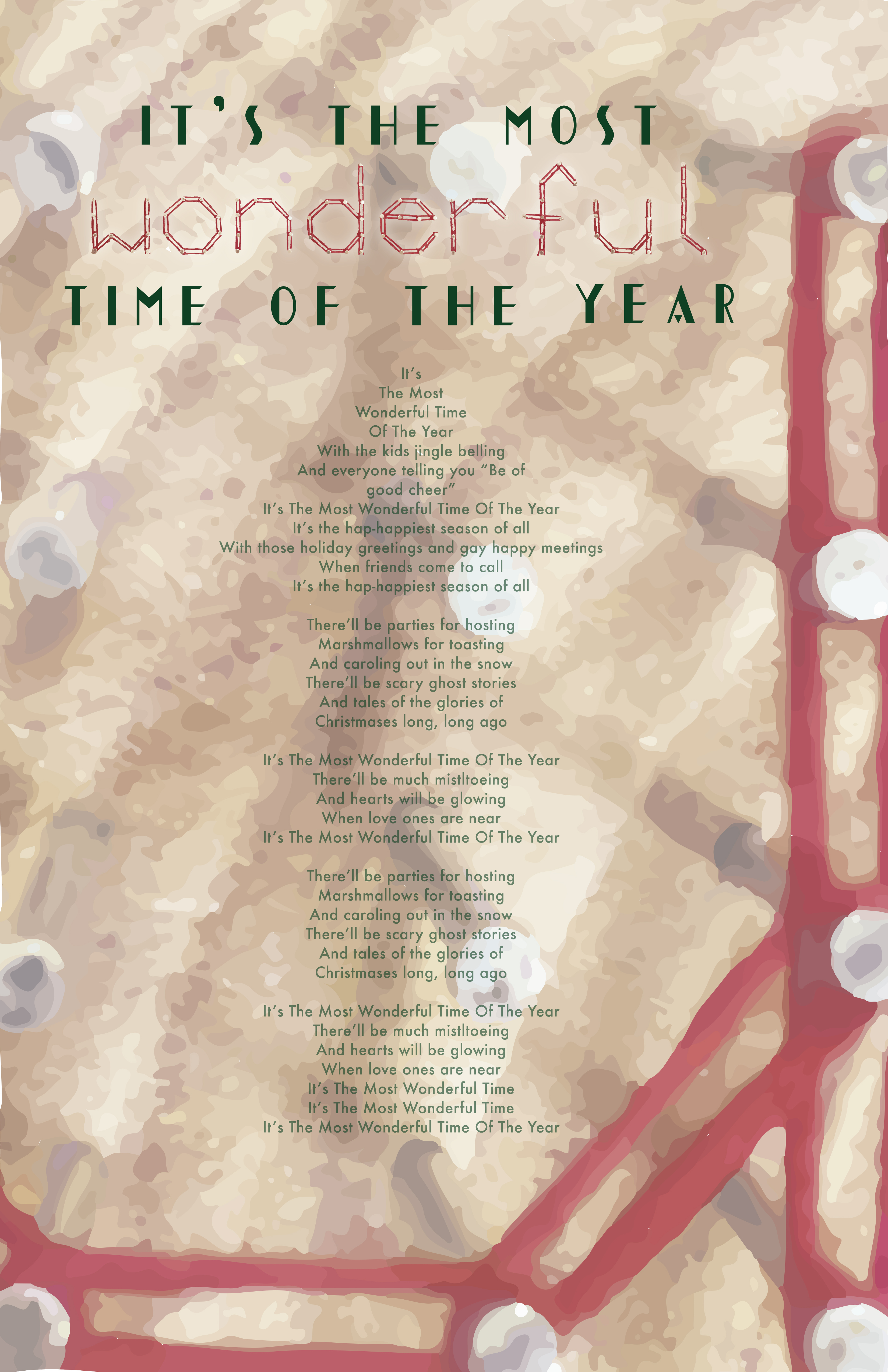
This text is a Christmas carol (a song often sung to spread the spirit of Christmas during the holiday season) entitled “It’s The Most Wonderful Time of the Year”. The mood that is being conveyed is happy, cheerful, and artistic. It is casual while still remaining structured graphically. From far away, it appears calm, easy, INVITING. The broadside attracts my attention from a distance because at first, the cool, calm, color of the background which strongly invites me in closer to observe it. As I approach the broadside, I start to notice there is similarity between the framed background and the typeface incorporated into the title of the piece.
Designed by Hannah Croskrey
Because of this the broadside holds my attention as I come closer and closer to it. I am intrigued by the contrast of the typefaces chosen in the title. The cold, harsh, bold, black typeface in the title intrigues my eye. However, the typeface Hannah has created is thin and colorful. Despite this, I feel they work harmoniously together because of their geometric nature. They are both free of organic curves. The softer angles of the typeface Hannah created compliment the word it is spelling out: “wonderful”. I believe this makes the broadside very strong, especially up close when it is legible.
The large part of the broadside that is most eye-catching (especially at a distance) is the blurred illustration-like close up imagery of the typeface Hannah created. I love how this ties into her typeface and the title. I think it adds to what might be a broadside that doesn’t give enough credit to her created typeface, and makes it more than just a font that is part of the title. I am curious as to if someone not in this class, knowing what she did to create her typeface hands-on, would understand the connection between the graphic background she created to frame her text and typeface. I like how her text is illustrative (though subtle) in regards to what her text is about. We talked earlier in the semester about how elements or components of her text remind us of the Christmas season/holiday. The red, for obvious reasons, as well as the wood and nails having correlation to Santa’s workshop and making toys. Maybe how from a distance the nails in the typeface appear like lights which are obviously crucial to the holiday season. Also the simple matching colors of the typefaces of the actual text along with parts of the title unify the text and make it stand out (but not too much) against the background. The title is still the focal point while the text is small and understated. I think her hierarchy of her entire broadside works extremely well with drawing people in from far away as well as working to keep people engaged up close.
The chosen type styles are definitely appropriate for the text. The type style used for display level text could be a bit bigger, however, I understand for the paper proportion she chose why she decided to use the size she did for her title/display level text. The typeface she created and employed for her display level text was appropriate, especially with her use of eye-grabbing color and distinct character. But, when seeing the broadside from a distance it can be tough to make out the typeface Hannah created at the display level text. However you can make out the other display level text she employed as it is thicker and bolder.
The type style used for the main text seemed very appropriate. It is a serif, more formal type style which seems more classic and traditional which definitely compliments her text. It is very easy to read and there was no hyphenation issues. The only aspect of I don’t understand is the way in which it was decided to capitalize, not capitalize, and when to create a line break as it seems a little bit uneven. From a short distance however, the body of the text seems to have a great shape. It was only when I was up close that I began to question these things (i.e. some lines being over short). In regards to her type style for her text, I love overall its integration still with her typeface because of her chosen background. Her digital typefaces she chose to use still are blended with the background image of her created typeface so that even though she doesn’t use it often in her broadside, it is still prevalent and connected to her entire text. I also like how you can’t tell until you step up closer how the text that is not red is actually a very deep, dark, olive green. This means the entire text is either red and green which are obviously Christmas colors. This means the viewer might have more context for what they are reading once they actually START reading and notice the text is dark green instead of black. I appreciate how she still employed the two very prominent colors of Christmas without hitting the reader over the head with it and making it appear very cliché and generic.
I wish this broadside could be a bit bigger or larger. From far away it is hard to catch my attention. I believe she used the proportions of the 11×17 wisely and effectively. However, the size of her typefaces utilized in her title are hard to see or notice from far away. It is the image of her background (still technically her typeface) that draws me in from afar. I feel if she were to blow up her broadside just a bit larger in order to make her text size larger while keeping the same proportions, I feel her broadside would be more effective from a distance. I like the framing of her text, especially the leading between her typefaces in the title of her text. The leading in her main text is effective as well as it is large enough that even though the type is small, it is still legible, easy, and natural to read and follow the text. I think the tracking of the last four letters in the word ‘wonderful’ could be adjusted to be closer together. I also like her marking of sections are separated by a line space. I think it breaks up her text nicely and evenly in chunks of the song (even though I am not quite sure how she decided when to break). I like the center alignment of her text and how it complements the framing on the page. It reminds me of how I would view a carol book if I was a carol singer singing this song. The letterspacing of the “it’s the most” and “time of the year” in the title of this broadside I like because it balances out the boldness of the letters and also appears like it is almost mounting the principal point in the title which to me is the illustrative typeface.
