
I have been paired with Brian for this broadside critique.
Designed by Brian
DTC 338.02
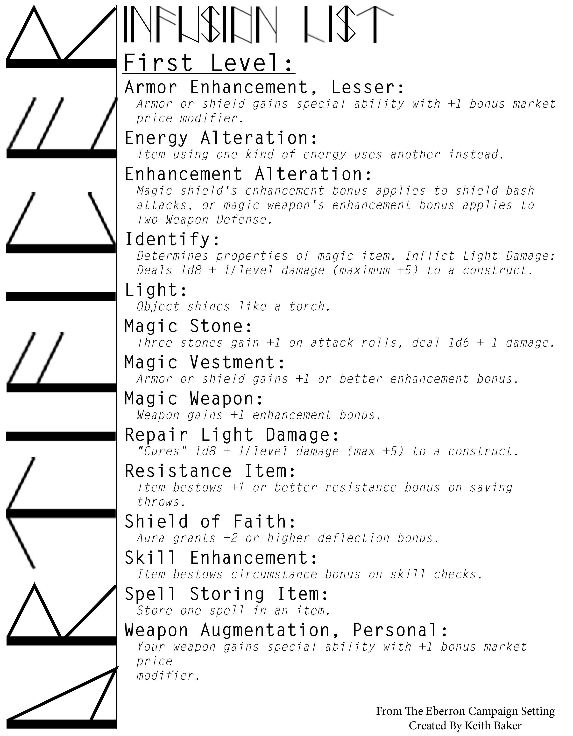
1. The text is an excerpt from The Eberron Campaign Setting by Keith Baker. It is a guide to the fictional game, Dungeons and Dragons. The text discusses the first level ‘Infusion List’ and lists off the enhancements, skills, magic, and weapons that are available and provides a description of each and the bonus that come with. The mood of this text is more serious, appealing to fighting and violence and the magical qualities the game possesses.
2. The Broadside uses visual hierarchy to draw in the eye. The first thing my eye saw was the text reading ‘Artificer’ in Brian’s custom designed typeface. Although it is placed at 90 degrees to the left, it is set at a large size and utilizes quite a bit of space. Brian’s custom designed typeface provides contrast from the rest of the broadside, as it is the biggest element within it. The next element I was drawn to was the ‘Infusion List’ title, which is also in Brian’s custom designed typeface, placed in a smaller size, but still big enough to stand as a title. Next I see the ‘First Level:’ text which stands as a subtitle and introduces the first level of enhancements weapons, and magical powers. Brian does a good job at using visual hierarchy and this is apparent through his use of the same typeface in different sizes. He uses a large, dark typeface for each subsection, such as ‘Armor Enhancement, Lesser:, or ‘Energy Alteration’. Underneath he uses a light weight version of the same typeface for the description of each. By placing these two versions of the same typeface together, Brian creates great contrast.
I would say this broadside needs more oomph to catch my attention. Although he utilizes visual hierarchy well within the page, it does not grab my attention and looks rather plain. I think using color would benefit his design.
3. As I discussed before, I agree with Brian’s display typeface choice. I think it is good that he found a typeface with different versions and he modified them to work for his chosen text. I would say the descriptions for each subsection are a little light and are hard to read from a distance. Maybe he could play around with this by adding a stroke.
4. I have already discussed the size/scale and marking of sections above. I would say he could work on the leading (line spacing). Personally, I would put more of a space after each section and its description to use white space as an assumed line break. This would help to break up the text and would provide more of an optimal reading setting. I like the tracking (letter spacing) settings he used, especially in the subsection texts. It gives enough space to stand as a title or plane, but does not make it harder to read.
5. I definitely think that Brian could have used color in his design. Maybe he could have used colors that reflected the book and game? I think that would help to tie in the whole concept, as well as attract the eye to the broadside. I looked at a picture of the book and it was filled with lots of color and texture. If he included some of those elements in the background, people who play the game and have read the book would recognize the same theme used and would probably be attracted to it more! To me, it looks more like a handout than a broadside poster, but with a few adjustments, such as color and texture, I think the whole concept could be enhanced.
