
Poster shown in WSU Library Course Reserves
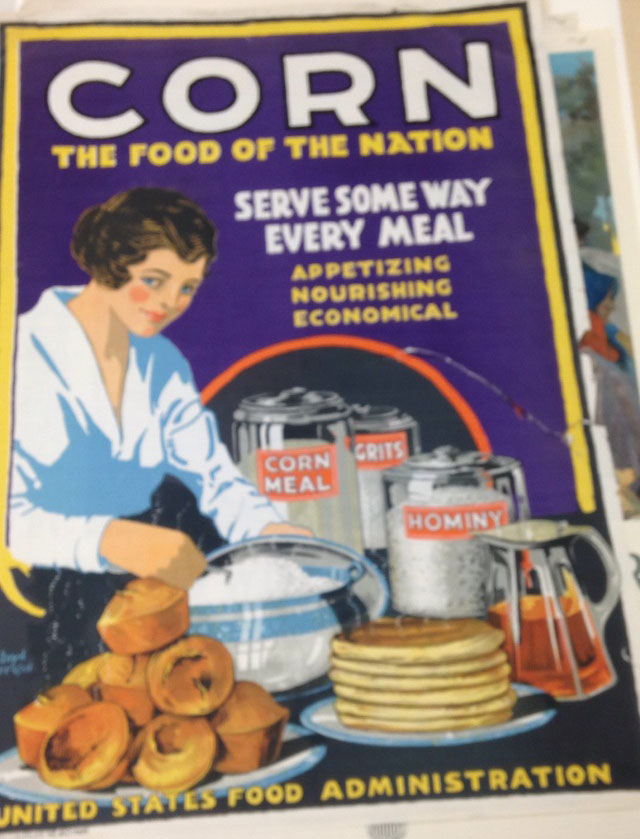
Based off of Schlesinger’s essay a broadside is defined as “A sheet of paper printed on one side only, forming one large page.” There is more to a broadside other than being a large sheet of paper. Schlesinger says, it “is a form of street literature, a public work of art designed to be read outdoors, rather than in the library.” He says that the selection of a particular paper or typeface can be illustrative or at least suggestive and by that he is correct. The visual image I chose is an example of a broadside using the design concept of integrating images. Integrating images in a broadside is, the “overlapping and intersection between text and image to make a beautiful composition when examined in detail ad they show us new things about letterforms and images and images as letterform.” As Schlesinger says total immersion is, “the text is an image and the image is a text”. The broadside I chose is a piece of advertising telling the people in 1917 to serve corn in every meal somehow because it is appetizing, nourishing and economical. The design of the broadside uses large display type, which is a larger size type usually 36pt or larger. Some of the display text is in a contrasting color regarding the purple and the yellow eye popping contrast to be seen from far away next to the bold white letters of “”Corn” to grasp the first attention of the eye. The size of the broadside is very large on about a 24 inch by 36 piece of a medium thickness paper. The letters of the headline “Corn” are the largest with wide kerning between the letters. There is an image of a woman making baked product with corn in them on the left corner side of the page and so the text follows the curve of where negative space is given from no part of the image being there. When the text fills that void of space where the image is missing, the text is emphasized by the alternating colors of white and yellow between each section of a different line of communication. At the bottom of the poster there in more text in display level font stating who the poster was for, the United States Food Administration. This poster uses three different types of fonts to show emphasis and importance of wording. The largest letting is on the top of the page and as the lines of letters move down the page they get smaller. The letters on the second line under the title is the same font as the descriptive words under the text that says “Serve some way every meal”. This broadside uses overlapping of the images to show depth in the image but the text that overlaps are the labels on the cans showing the ingredients the women is using of corn meal, grits, and hominy.
