
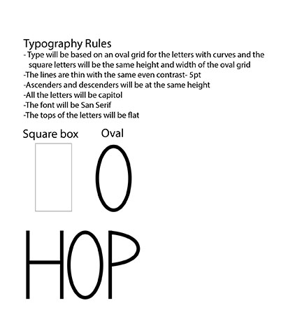
For my alphabet design I plan to use the modular method of design to define my rules for my type. I chose to do a sans serif all capitol alphabet because I am using a poem by Shel Silverstein called “No Thank You”. The rules I made to define the design of my letters are, the lines of the letters will all be the same even thickness of five point throughout with no contrast. The grid system I am basing the letter forms off will be a tall skinny oval one for the letters with curves. For the letters height and width I made a rectangle box to have the letters fit in so they are all the same size. The ascenders and descenders will be at the same height to fit in the box so there will be fluent continuity. I am choosing to make all of the letters capitol because in the sense of the poem, the feeling is slightly funny and passive aggressive. I made the font be sans serif because it will look more modern and clean so the tall skinny letters wouldn’t have any elements added onto them to make the type look different. The tops of the letters will be flat as well because I didn’t want the tops to be pointed. Overall the feeling of the font will be modern but light to go with the sarcastic poem, “No Thank You”.
OFFICE HOURS
Tues and Thurs, 4:05-5:00pm, Avery 479 (office) or Avery 105 (lab)
EMAIL: kristin.carlson@wsu.edu for an appointment
Blog Posts
- 201 Blog
- Archives
- Fall 2014 Archive (336)
- Fall 2014 Archive (338)
- Fall 2015 Archive (336)
- Fall 2015 Archive (338)
- Fall 2016 Archive (336)
- Fall 2017 Archive (336)
- Fall 2017 Archive (336)
- Fall 2018 Archive (201)
- Fall 2018 Archive (336)
- Fall 2019 Archive (201 Blog)
- Spring 2016 Archive (336)
- Spring 2017 Archive (336)
- Spring 2018 Archive (336)
- Sample Posts by Students
- Sample Posts by Your Professor
- Uncategorized

Shannon: These rules are fairly specific, yet they seem arbitrary and rather generic. (Note that you don’t have any ascenders or descenders if you’re using all caps. However, you do need a decision about where crossbars would go.) I am not convinced they are related to the concept behind the writing you describe. Why, for example, does no contrast + taller than wider = modern ? More importantly, why does this visual impression seem suited to sarcasm and passive aggressive tones? The overall evenness of the stroke seems more generic than funny/sarcastic, due in part to the fact that it feels very obviously generated with basic computer software drawing tools. Work more to conceptualize and defend your rule system in relation to your poem.
LikeLike