
I chose the song “World Alone” by Lorde. The song is slow paced, gradually building so I want the font to portray a feeling of movement,to do so I am going to have outlines for the sizes but they will not be required to hit those measurements dead on (after some hours working like this I have decided instead to set multiple specific places for letters descenders, ascenders and bases to hit, in order to give it at least somewhat of a cohesive feel). It is a love song but not overly dramatic so I am leaving room for long ascenders and descenders to give it a romantic feel. I don’t want it overtly decorative or tacky so the ascenders and descenders will not have tons of extra loops or lines but they will avoid straight lines to keep a sense of movement and a delicate sense. It will be in lower case for now, if I chose to do upper case the uppercase letters will be more decorative than the lower ones. The lines also use an oval brush, giving it a more organic and less serious shape.
My rules:
Serifs
2×6 units(this will need to be altered)
avoid straight lines
avoid hard points, stick to curves
minimal extra decorum
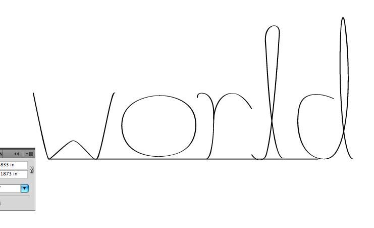

Karen: As discussed in class, adjust your rules and grid format so they will help make the letters that have the visual impression you desire. Change the grid if you want longer ascenders, etc. In your rules, describe line quality if this is the method used to build the pieces of letters. Here, you have uniform contrast and the line is relatively thin. Also, rather than serifs, I would say your letters have a relationship to cursive writing: the beginning and ends of some letters (especially the L) show how they could connect directly to other letters. This is important regardless of whether or not you continue with this text or return to the Milan Kundera text. However, also work to make the visual impression appropriate for the text’s mood.
LikeLike