
Media Analysis Techniques. Cover by
Candice Harman
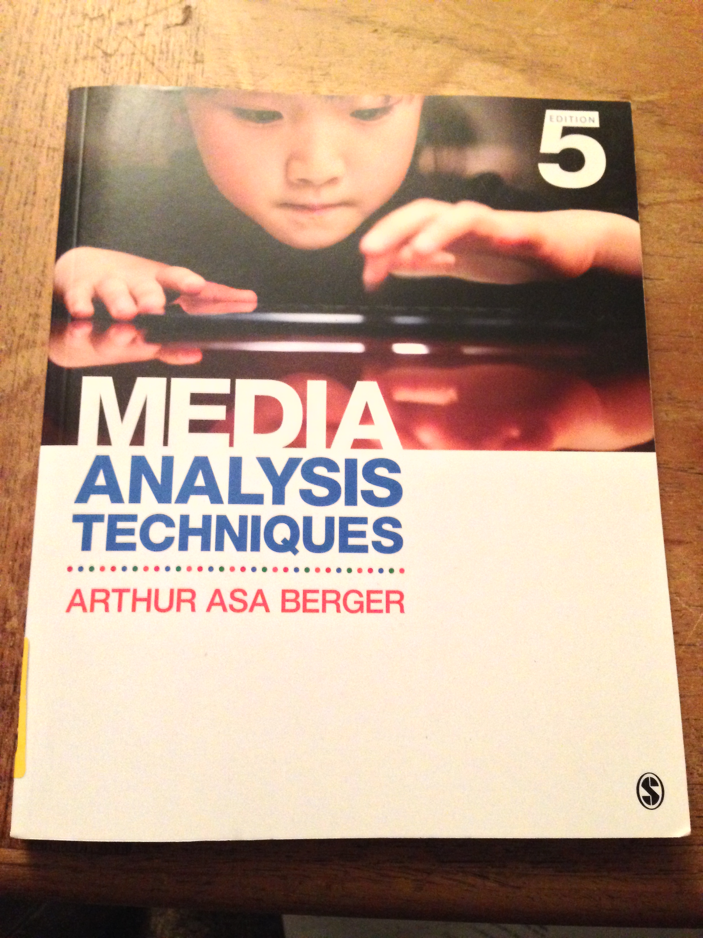
This is the cover of the book for my Media Criticism class. The cover features a title and byline in Helvetica. Helvetica serves as a very good neutral font for various uses, so it honestly isn’t very surprising that it is being used here (in fact, I have two other text books with Helvetica on the cover). Here, I think that the designer was trying to use Helvetica’s natural block style to make an even and balanced element for the cover. They use scale well, as the font size begins to decrease as the title reaches the bottom of the page, scale the importance of the title for the viewer.
The large scaled letters have much bolder lines than the rest of the font of the page. This serves to create a hierarchy and an impact to the design, telling the viewer what is important to the design and what isn’t. I think that the designer purposefully avoided using other type faces to instead help make a cleaner looking page design. The fact that the font is already stylized at the top makes me think that throwing in other type faces would just make the cover look to schizophrenic. The fact that Helvetica capitals don’t have very large serifs helps make the page remain clean, and avoids clutter.
