
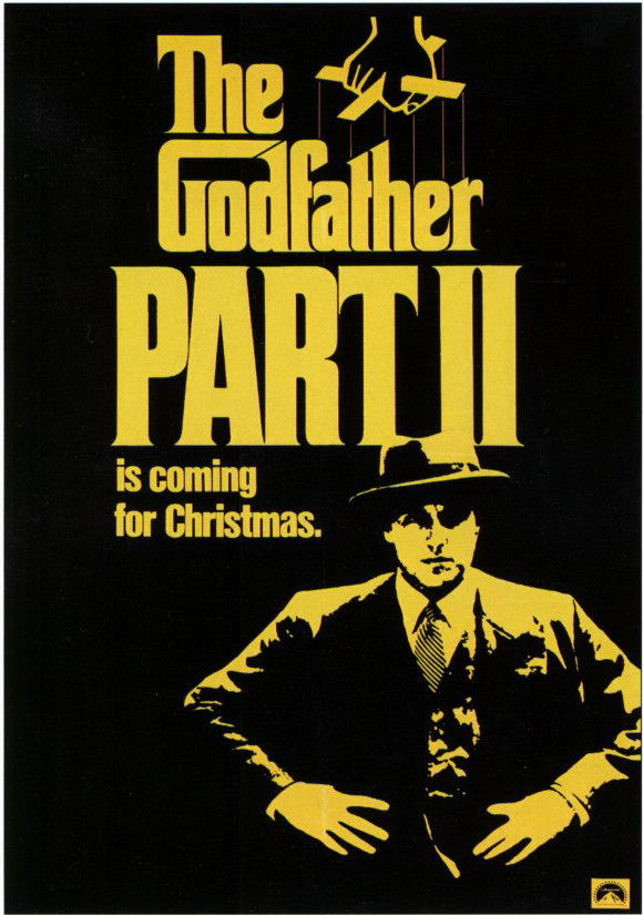
In this movie poster the The Godfather Part II, the text is center aligned on the top of the poster making its way down the page into the middle of the poster. The yellow typeface is important to the poster because it makes the text standout on the black background. Yellow is the only color used on this poster besides black, it is used for the typeface as well as the illustration of the man. The text on the poster changes from being lower case, upper case and back to lower case. Caps being used on the poster are used to emphasize importance. The “Part II” is in all caps which makes the eye go straight to that text, it shows that this is of most importance, it tells the viewer that a new movie, part II, is coming out.The creator of this poster also thought about scale when creating this, hierarchy and contrast is developed through the mix of typeface. On the other hand, the scale and width of the text is very compressed. All the text have very little to no spacing in between each letter. There is also a mix of different typefaces, “The Godfather” is the typeface that carries throughout most of The Godfather posters I looked at while the “is coming for Christmas” typeface is way more simplistic which gives it a feeling of lesser importance. To me it does not seem to fit well with this poster, it looks like an after thought. I think that the typeface is correct for this content because the typeface for “The Godfather” is used for all the posters. The typeface is dramatic but simplistic which I believe fits well with the movie and mobsters.
The Godfather poster from http://www.moviepostershop.com
The Godfather poster from http://www.moviepostershop.com
