
If you look at the poster for 127 Hours, the font choice may not be the most visually exciting thing to have ever been done with type on a movie poster, however browsing through several I found that it was one of the most effective posters. This is in part because it utilized what we just learned about color to great effect, but it’s simple typeface appearance works well in tandem with that.
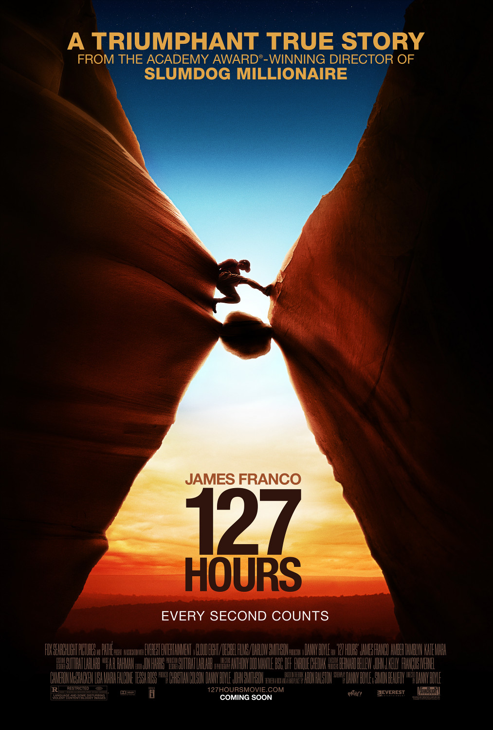
The title of the movie is the most important part of the poster, If a potential viewer were to see the poster, and loved James Franco, and Slum-dog millionaire, that might convince them to go see the movie, but if they don’t know what the movie is called, the rest would be irrelevant. For this reason the designer made “127 Hours” much bigger than anything on the poster, and used a very heavy weight. Also as a San’s serif font, it is much easier to read quickly, which is the point of a poster. I think the “127” is that much bigger than the “Hours” primarily so that the fonts could use similar kerning and Horizontal scale. (i.e. stretching out the 127 would make it appear awkward, while squishing the hours further would make it harder to read) The kerning does make the title feel a little squished though, but the size and weight of the font make it easy to read. I think that this is because of the themes of the movie, the main character is trapped, squished under a rock and placing it there between the 2 rock faces and making it feel squished gives a sense of claustrophobia underneath them.
Looking at the other parts of the poster, The name “James Franco” and the title “Slum-dog Millionaire” use similar sans serif fonts and are the next most weighted, as well as the claim that it is a “Triumphant True Story.” This is because they are the next most important things, “Slum-Dog” won an academy award, and James Franco is a popular actor. It’s more important to associate the title “Slum-dog Millionaire” with the project than to make it clear that it’s the same director, which is why that middle line is weighted less.
