
For my Typeface Anatomy Analysis, I chose a Powder Magazine Cover that shows contrasting typefaces which, together, create an eye-catching, attention-grabbing magazine cover.
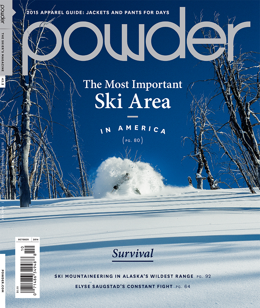
Powder Magazine Cover
First, the easily recognizable title for the magazine “powder”. I noticed that each of the letters was in lowercase form. This, along with the symmetrical line weight and circular counter-forms in letters like “p”, “o” “d” and”e” create the feeling of togetherness like modern sans-serif typefaces yearn to do. There is, however, one contrasting element within the magazine title which adds to the recognizable nature of the brand. This is the “w” in the word “powder”. the w goes away from the vertical axis that the other letters sit on. The letter form begins to feel like it is heavier on the right as the downward sloping lines curve and point to the right, giving the letter a more artistic quality.
The second part to my analysis concerns what the feauture story in the magazine is, “The Most Important Ski Area In America”.
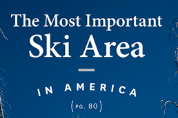 The two-part type elements concern a more traditional, serif type containing a higher x-height while using a scaling technique, placing more emphasis on “Ski Area” as a way to draw the viewer in and wondering, based off the picture if they can identify which ski area it is. The second part, “In America” is not only seperated by a line, but it is in a rainbow shape while yet in a modern sans-serif font contrasts with the traditional type from above. This, along with wider letter spacing stands out and blends in nicely, despite mixing typefaces.
