
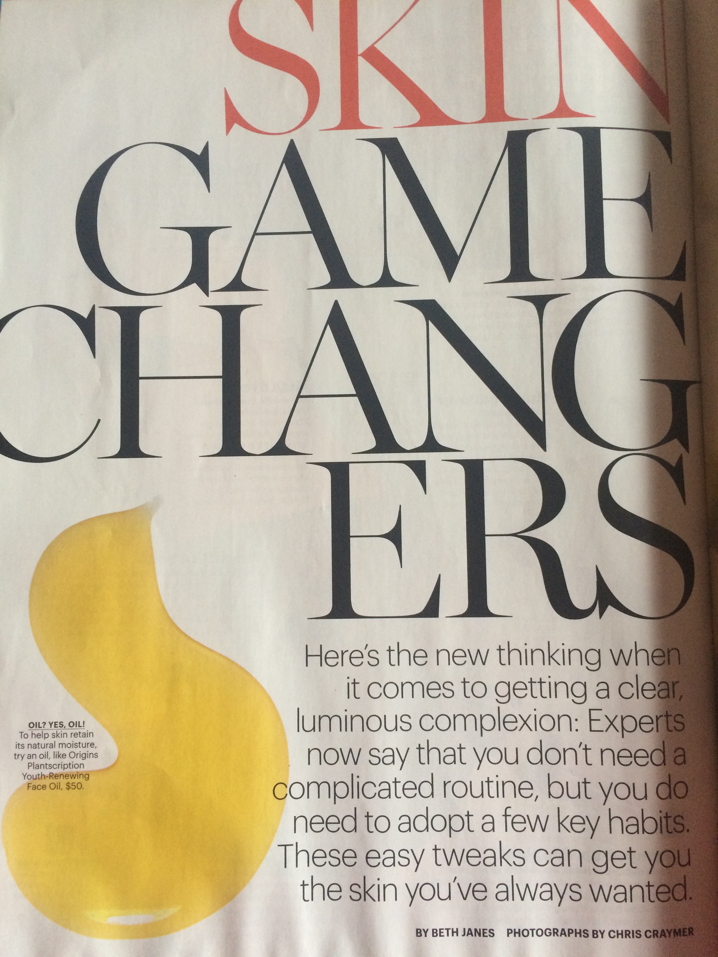
“Self” magazine, page 96, April 2014
I found this to be an interesting headline when I was looking through a “Self” magazine. What really stood out to me about this headline was that it is “thin and high strung” which is a characteristic of a type that is used for a headline according to the reading. As well as being the largest text on the page, it is a serif type. This creates a contrast with the remaining text on the page. It is important because the remaining text is meant to be more informative therefore the san serif type that the designer chose to use is much smaller and has a heavier stroke than the headline but does not overpower it. This creates a hierarchy through contrast in scale because the headline is a much larger point size than any other text on the page. At the top of the page the word “SKIN” stands alone and further stands out from the rest of the headline “GAME CHANGERS” because it is in red making it the only text on the page that is not black.
“Self” magazine, page 96, April 2014
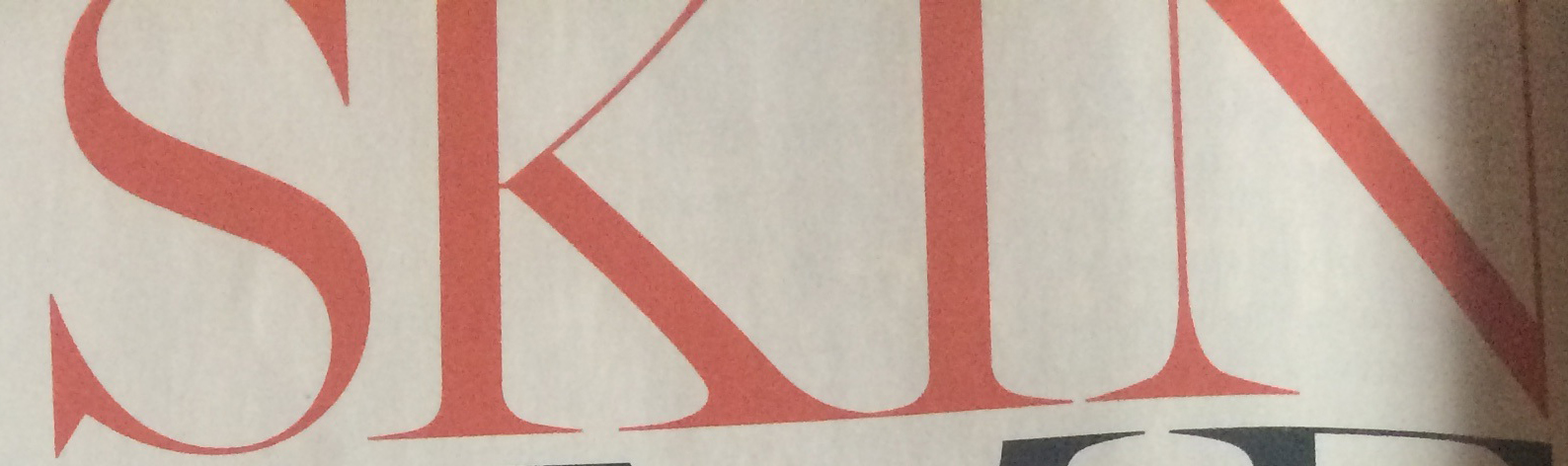
Fundamentally, the structure of the font that the designer chose to use for the headline works well because it is the largest text on the page and it is “thin and spindly.” It stands strong on the page because of how large of a point size it is and its scale compared to everything else on the page. If it were at a point size that was smaller then 24 pts it would be weak and as a result it would not be a prominent element on the page and the basic text might stand stronger because it feels heavier at a much smaller size. Another thing that I noticed about the headline is that it is in all caps so the x-height is not a relevant characteristic of this headline. I also noticed that there is a very small width space between each letter. I would classify this type as transitional because it is sharper and less calligraphic than humanist serif type. In some cases the letters in the headline touch but in other instances there is a sliver of space between one letter and another. For example, in the word “SKIN” the “S” and the “K” do not touch, but the “K” and the “I” touch at the bottom.
