
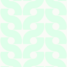
Bep, Karel Martens, https://www.patternfoundry.com/patterns/bep/patterns
This pattern that I chose to evaluate for this blog seems to be made up of the letter “S.” When I originally looked at it there were two of the same patterns that were next to each other. The one on the left seems to be composed of these shapes that create the illusion of the letter “S.” I also think that since the white negative space does not have a strong contrast with the seafoam green (which is a tint of green since there is a lot of white present in the green) positive space. This blends the circular and triangular shapes that create the illusion of the letter “S”. Also, this pattern is tiled in a way that there is a little extra space on the edges. This causes the circular and triangular shapes to not completely match up which enhances my eye to see the letter “S” throughout the pattern.
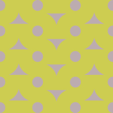
Bep V, Karel Martens, https://www.patternfoundry.com/patterns/bep/patterns
Whereas, in the other pattern there is a stronger contrast between the desatuarated green and desatuarted purple, this makes it apparent that this pattern is organized in a grid. Therefore, this pattern is more geometric and is composed of circles and triangular shapes that alternate direction in every other column. This pattern also seems to be tiled with no extra space along the edges of the pattern so the circles on the boarder match up perfectly because there is no space when the pattern is tiled they overlap perfectly so that the pattern is consistent when it is tiled and creates circular and triangular forms.
