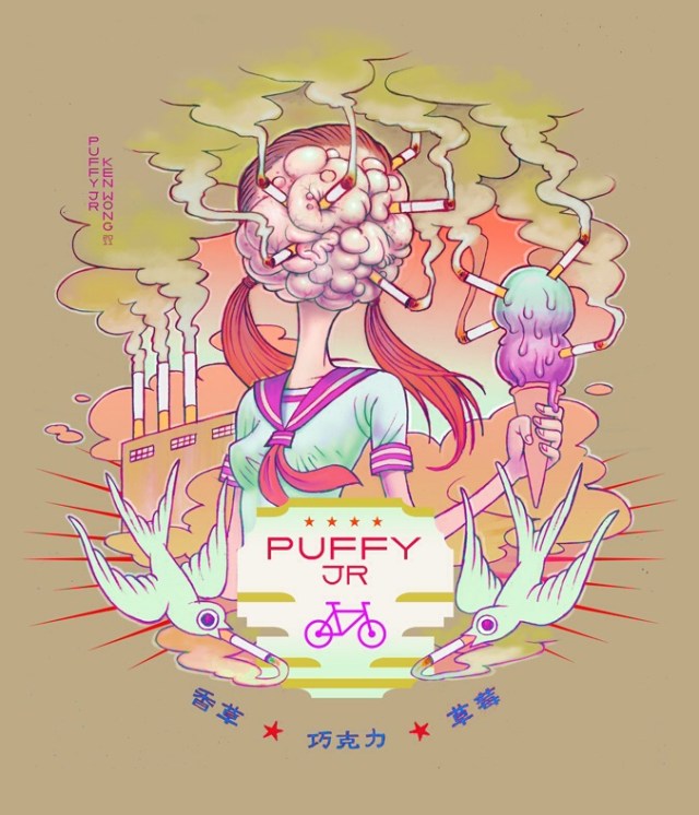
In this piece by Ken Wong, the colors all seem to share the same shade or tint. That is to say, if converted to purely grayscale, the colors would all seemingly be the same. The hues in this picture look to be pulled from the darker end of the pastels. The color that has the steepest contrast to all the others is the pinkish purples of the “brain” and the accents on the shirt, the icecream and the bicycle icon. Surprisingly, this is image has a really dull, muted color scheme but it’s still fairly warm due to the yellow greens and the soft oranges in the background. Some of the colors are somewhat complementary but most of the colors are analogous. As I said at the beginning they all share around the same shade or tint. I mean, yes there is pinks, oranges, greens, and yellows, which are all close complements but the fact that they’re the same tint, they become more analogous. There are blue and red accents down at the bottom that don’t really fit in the color pallete of this piece but yet they don’t stick out so much that they are disruptive to the piece. Lastly, the saturation of the color is very low. That is to say the intensity of the colors are not very high. The colors in this piece, with the exception of a few pinks and purples, are fairly muddy and dull and desaturated. Overall the value of this piece is fairly dark everywhere but the center where all the bright whites and light blues are. This is because the dark dull muted green background the vibrancy of all of the other colors are pretty low. Ken Wong “Puffy Jr”
OFFICE HOURS
Tues and Thurs, 4:05-5:00pm, Avery 479 (office) or Avery 105 (lab)
EMAIL: kristin.carlson@wsu.edu for an appointment
Blog Posts
- 201 Blog
- Archives
- Fall 2014 Archive (336)
- Fall 2014 Archive (338)
- Fall 2015 Archive (336)
- Fall 2015 Archive (338)
- Fall 2016 Archive (336)
- Fall 2017 Archive (336)
- Fall 2017 Archive (336)
- Fall 2018 Archive (201)
- Fall 2018 Archive (336)
- Fall 2019 Archive (201 Blog)
- Spring 2016 Archive (336)
- Spring 2017 Archive (336)
- Spring 2018 Archive (336)
- Sample Posts by Students
- Sample Posts by Your Professor
- Uncategorized

