
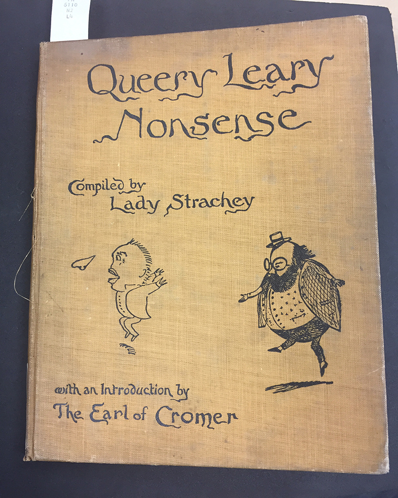
The Cover for Queery Leary Nonsense. Its shows the typeface that I enjoyed when looking in the archives. (Lady Strachy, Queery Leary Nonsense, Mills & Boon, London, 1911)
Based on what I observe on all texts I could during the visit I noticed that in everybody of text there is always a height limit. Like in the reading talks about where the cap height limits the size of uppercase letters and any letters that have an ascender as well as a descender when its limited in the bottom cap. I also noticed that each body text keeps consistent by either using a serif type or a san-serif type, there can be no mix within the same body text. Of course, starting new bodies of text like paragraphs then you can change the font type and size. The type that got my attention is from a cover page of a book called “Queery Leary Nonsense” compiled by Lady Strachey. I like that way they did he text for it. It looks like it was scribbled in the last-minute but of course they took time to perfect it. Looking at it closely you will see that some of the letters are slightly different but for some reason it works. For example, the letter s in Nonsense has two different ways they drew it, one of the s has a descender when the finial should end. While the other stops where the finial is located at. The type face goes well with the title and the diagrams of the cover because it gives you a sense that this book will be humorous or each chapter doesn’t connect with each other in any way or even the text will be nonsense like in the title says. It also demonstrates that not all typefaces need to be sophisticated to be considered a type face. Some typefaces can break some of the rules that define a type interface.
