
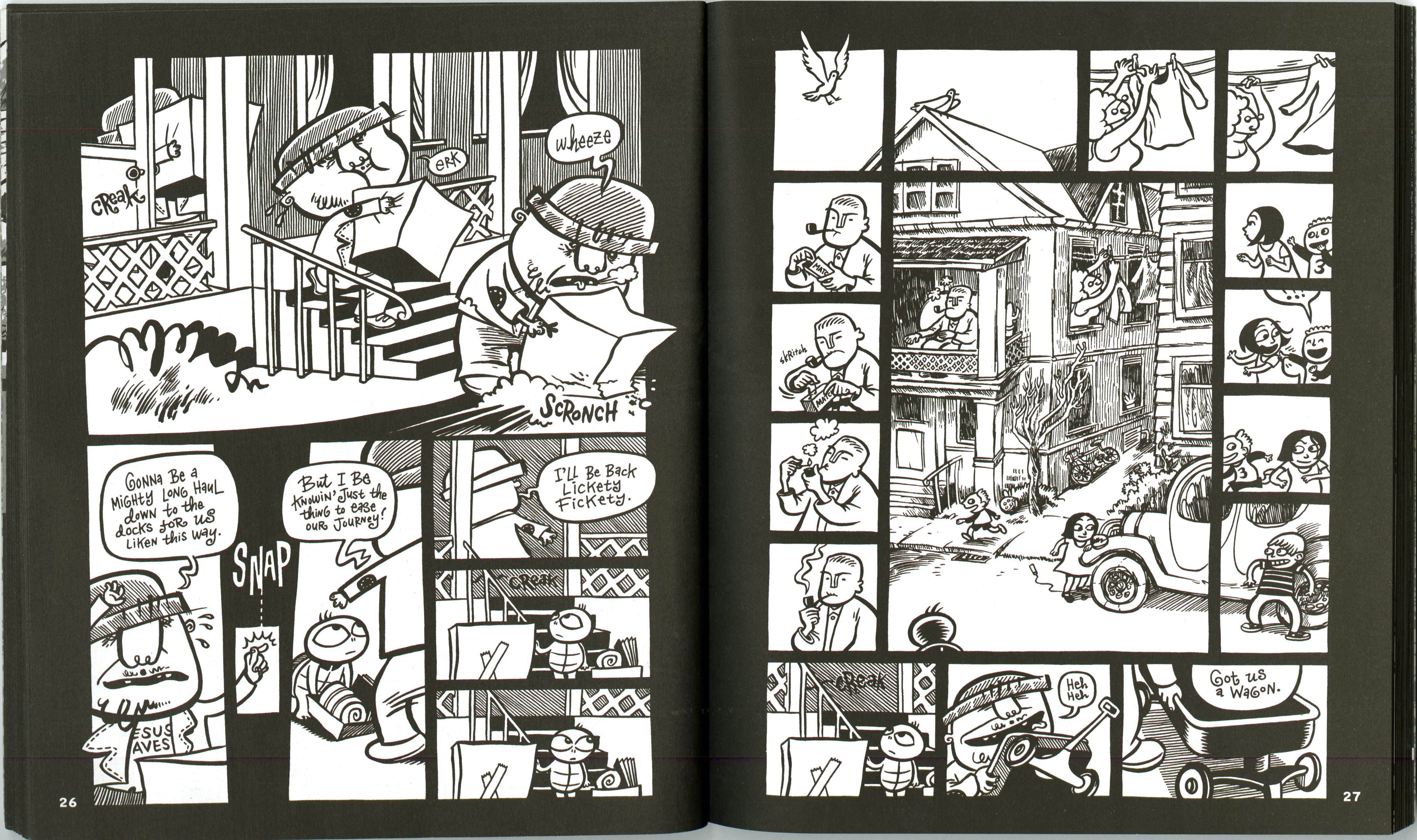
I am unsure the name of the comic that this photo comes from, but it did come from when
Book from the CDSC
we went to the CDSC and look at the variety of books. The reason that I thought this one applied really well to this chapter was because of the very literal framing that is shown in these pages. Although the pages are very different from each other, they are similar in so many ways. The color between the two pages’ correlates so that you know it is the same idea or concept, but the orientation of the frames are different. There is a margin all the way around the outside of each page to indicate that each page is a frame. Not only are there margins however, but there are individual frames on each page that illustrate different things happening. Something that I thought was particularly interesting about this is that some of the images actually run outside into the margins of the page. I think that this is a point of focus, something that your eye is drawn towards. I particular like this style because of the use of a black background and the white space to create images. This page really uses the technique of cropping, each frame crops the picture in a specific way to focus your attention on that part of the picture. This is a technique that is explained in Lynda Berry’s Graphic Design The New Basics. But I felt that it really applied to Framing and this page in particular .
