
With this page from Chris Ware, the framing is straight forward with little overlap. There are a few frames that have overlapping imagery that makes the comic feel more natural and scalable. The flowers stem on the top half is implied to be where the frame is, which is part of the margins and bleeds technique. As the comic needs to, the frames become frames within frames, making them smaller and making it easier to tell the story in a small amount of space. The title being centered in the paper draws the eye as it is the biggest part of the page, and after the viewer reads the title, they will naturally move to the top left corner.
Once the comic moves on, it get’s darker to match it’s more serious tone, and the scale of the frames starts to become more varied and duller in color. This sets a tone that tells the reader what was once a potential happy story is now a more realistic story. The cropping of the frames and the way the frames are set, there is little else to focus on aside from the characters. When the larger text shows on the screen, it draws the reader’s eye and makes it so there’s a parallel to the first part of the comic. What could have been a simple story that has been told a hundred times was crafted in such a way that it is interesting and compelling.
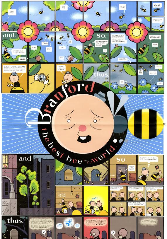
Branford, the best bee in the world by Chris Ware.
