
page 65 from the Graphic novel The Best American Comics by Harvey Pekar and Anne Elizabeth Moore
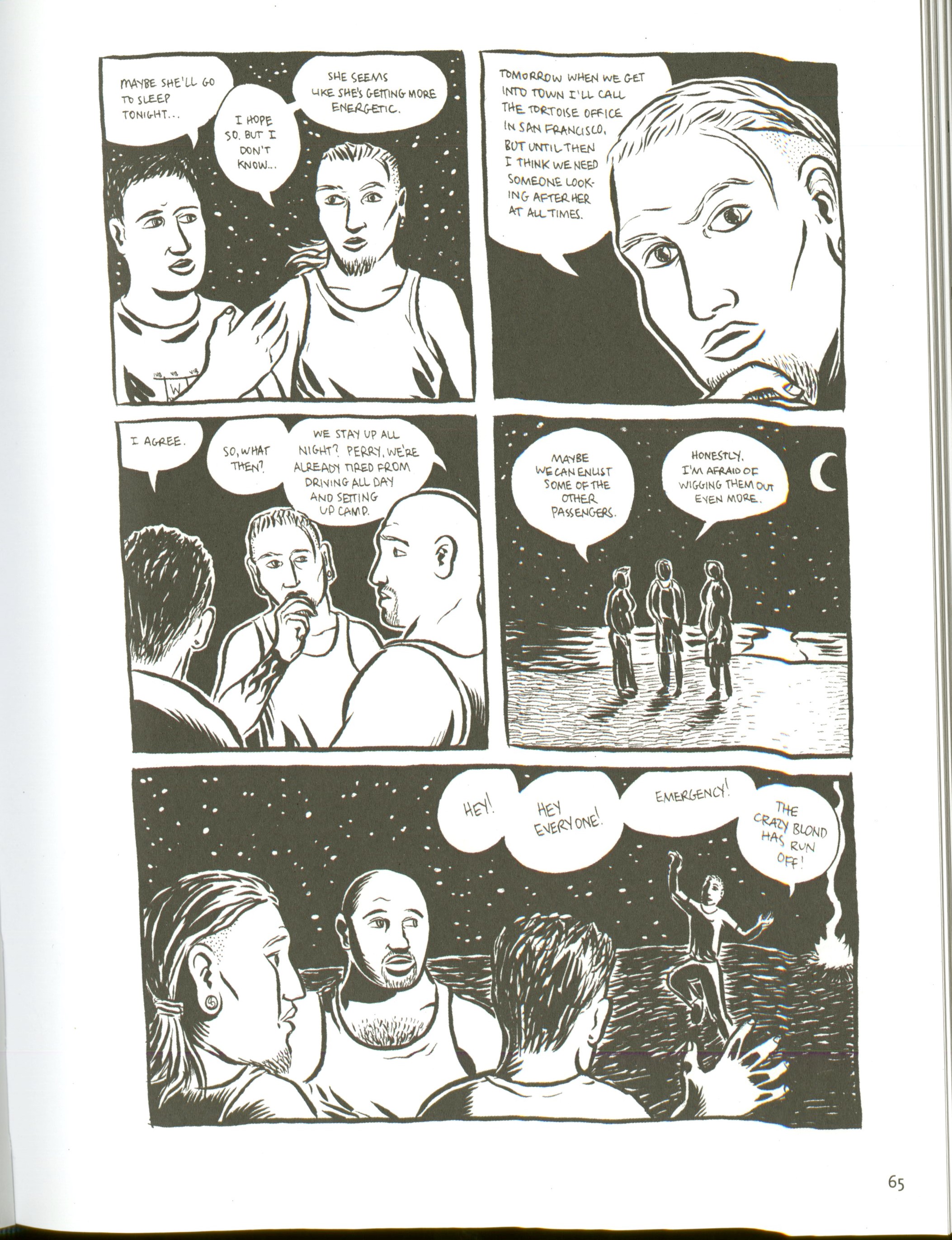
This page from the graphic novel The Best American Comics is a great example of the use of framing. The framing used on this page has the individual graphics in different sized framed boxes. The framing done in each individual comic strip helps demonstrate the importance done in each individual strip. The cropping done is some of the images helps create a framing on some of the characters of the story. It helps emphasize the importance in the emotions, this can be shown in the image of the upper right of the man. The organizational design possibilities offered by framing allows for the reader or viewer to have an easier way to read. This formatting also allows for a more precise and clear reading format, that demonstrates the traditional left to right, top to bottom reading. Having margins around the framing allows the readers or viewers eye to be directed straight to the images in the middle. The margins allow for a direct eye sight on the actual content. Then the margins between the individual images allows for a neater and more organized form to demonstrate the content. It also helps with having a clear and concise comic that the audience can easily look at or read. The framing used on this page also helps demonstrate where the story ends and continues. Like I mentioned earlier the images change in size and the framing done, thin borders, help the eye follow the movement of the story. Overall the framing used in this page from the graphic novel does a great job of demonstrating, especially 0n what the concept and design do to organize a story.
