
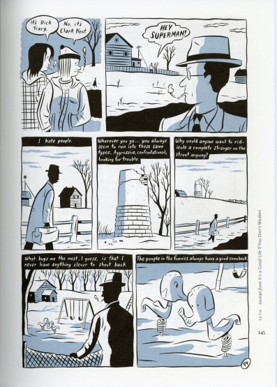
The image I chose for framing is an excerpt from It’s a Good Life if you don’t Weaken. One of the most obvious examples of framing is the literal margins around each picture, separating each beat/moment. Each set of text is placed across the top of each panel,
“Life is Good if you don’t Weaken” by Seth, Pg 94
including the dialogue. This text is shown to be with a specific panel due to the margins within the page as well as a solid line the same color as the text box around every panel except the first. The first panel is framed in a less definitive manner, as there is no solid lines around the image. This particular shot isn’t from the perspective of the main character. He doesn’t see and may not hear the events going on in this panel. In every other panel with solid line framing, you see what the main character sees.
There is also the use of cropping. In the center and last panel, the focus of the main character is on an object that appears in the next/previous panels at a farther distance. With the close up crop, you are looking at the objects through the main character’s eyes. With the longer shots, you see the environment around said object, establishing the location.
The way the character is framed within the panels is incredibly significant. In the fifth panel, he is less than one third of the height of the panel with nothing but an empty barn yard around him. This is the point when he feels the “smallest” or most insignificant.
