
Artist | Chris Ware
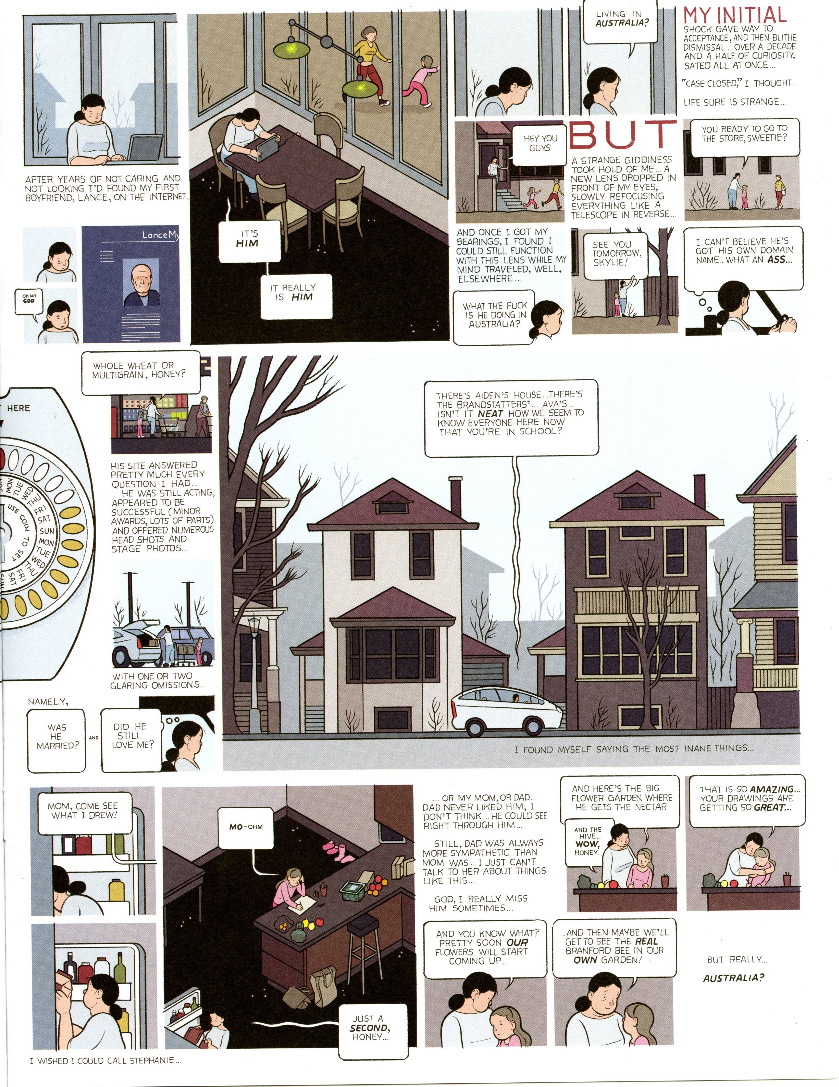
While reading the new chapter Framing, I realized that a frame is both limiting and limitless. From the collection of graphic novels, I chose to write about Chris Ware’s work. In this particular layout he chose to work with implied frames for the images and for most of the typography he chose to create a border. The page where the content sits serves as the main frame that limits the space. Although the space is limited, by using the concept of frames within frames, we have an abundant amount of choices to create the most aesthetically pleasing and effective layout to display the content. If we were to get into more detail, we could also talk about the many other frames that are being created in the actual illustrations. For instance, the borders around the window create a frame for the glass and the list goes on. Something I noticed and found interesting in this particular image, was that the artist at times uses the alignment of the text to create an implied frame. Lastly, I also noticed that with the word “but” the scale changes which helps create the implied frame on that individual piece. Like I mentioned, frames can be limitless and playing around with the scale, position or type of frame can contribute to the overall effectives of the design.
