
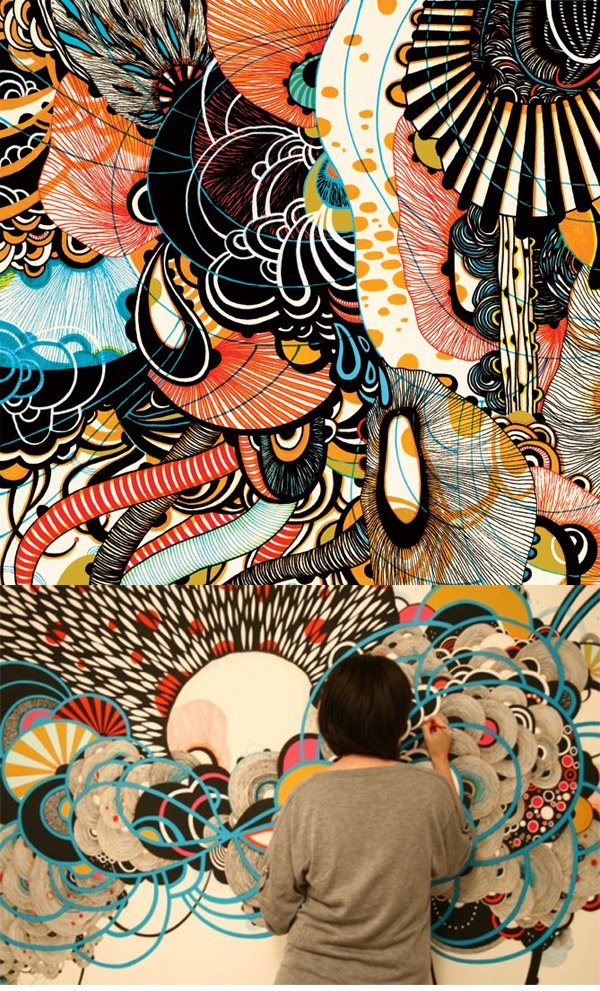
Designed by Bordalo and is titled “Garbage, the new street art aesthetic“
The first photo that I’m going to analyze and discuss is a representation of an organic pattern. This piece is named “Garbage, the new street art aesthetic,” and I believe that it has a great Urban City aesthetic vibe to it. The lines in this design are a large contribution to the overall flow of the of the pattern. It seems as if the visual organization is meant for the viewers eyes to travel from the top to the bottom seeing that the pattern tends to get more and more detailed as the piece reaches the bottom. The colors also play a large role in how it is viewed because the patterns tend to hold more drastic colors at the top such as orange, yellow, black and blue, and tends to gather more neutral colors towards the bottom such as beige and and black. I found this pattern to be organic because it holds a mass amount of abstract detail, and there isn’t a lot of symmetry within it but a sense of free pattern design.
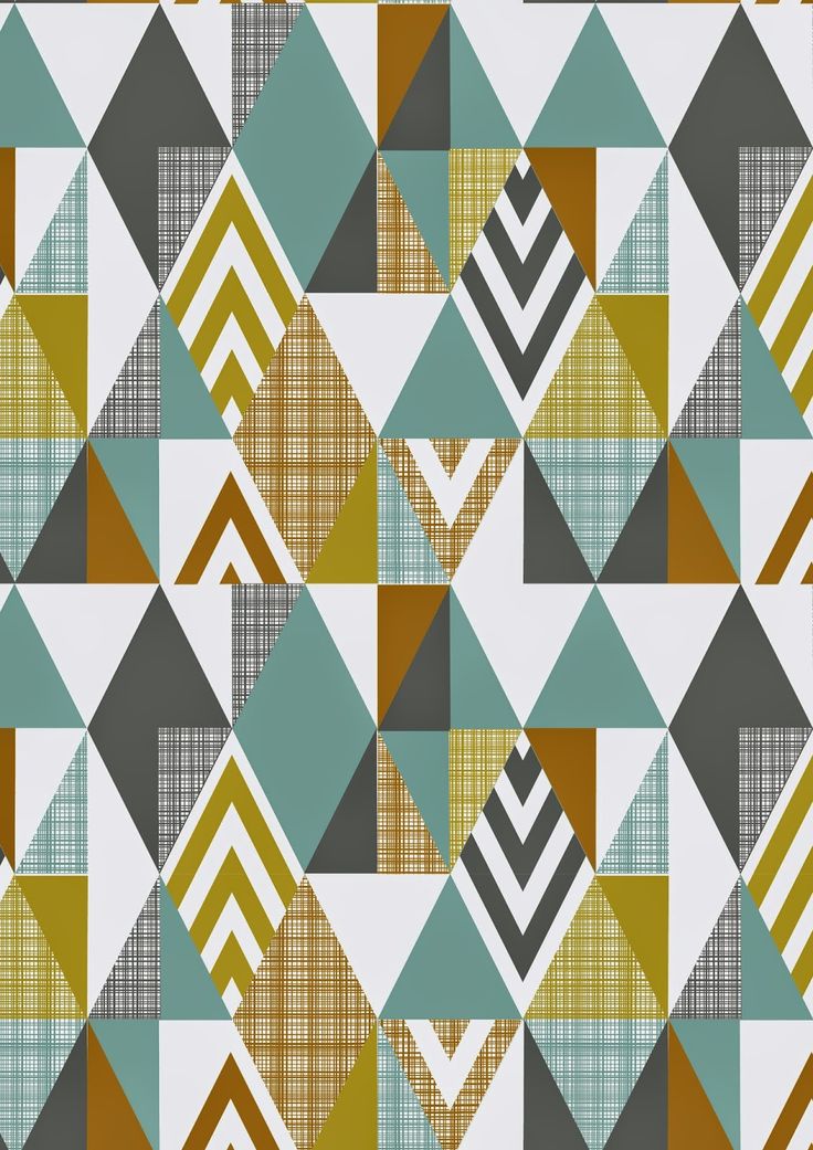
Created by Fashion Design Consultant Emily Kiddy: Used from corresponding website http://emilykiddy.blogspot.ca/2015/02/springsummer-2016-younger-girls-fashion_10.html?m=1
For my geometric design I decided to go with something that I discovered on a Fashion Design Consultant’s blog. The designers name is Emily Kiddy, and she is a freelance graphic designer. I found this piece to be a great representation of what a geometric pattern should convey because the elements within the design hold a solid amount of repetition and symmetry all while still providing exciting aesthetics for the viewer to enjoy. The colors, shape, sizing, and spacing are all very well placed and contributes largely to the overall flow of the pattern’s aesthetic. In fact, if you were to take this design and cut it in half horizontally, those two pieces would be almost, if not exactly the same. I can appreciate this design as being geometric because I believe that as a graphic designer, organic designs are very easy to be creative, but a graphic designer who can take symmetry/geometry and make it appealing is truly stretching their abilities as a graphic designer.
