

For the patterns selected, The Golden Road is one what draws on the more organic pattern as it is representational of a head and the form itself is more freeform rather than geometric or calculated. The other cover is more geometric as it uses rectangles to represent books and does so by repeating the shape in a mannerism similar to that of a bookshelf.
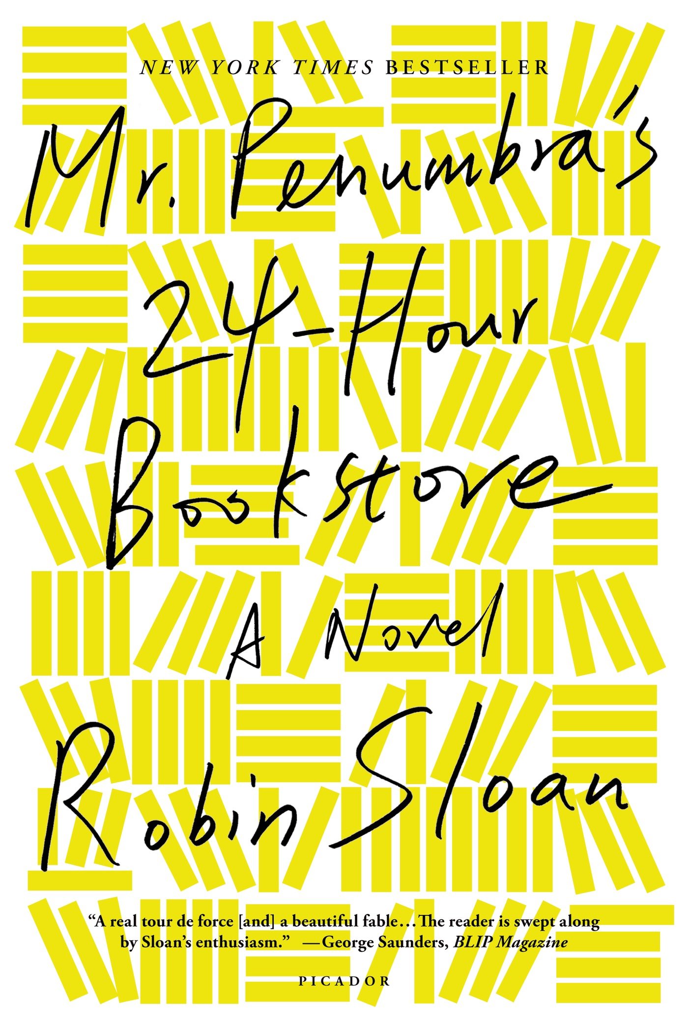
Following up on the cover of Sloan’s novel, there is only use of one color which does a better job of representing the whole collection of books and not just focusing on different books if there were multiple colors of books. Using one color pushes the idea of a bookstore more so. Also, the repeating use of rectangles are done so in a grid-like fashion by creating boxes that fit a certain number of rectangles.
For Millner’s cover, it repeats the pattern in a point format by repeating heads in the same exact manner. However, due to the colors being used, they appear to be more of complimentary colors as well as near analogous colors in order to reveal that the head represents same but different. How every person feels unique but is really similar to others of their characteristics. The saturation of color in the design gives it a more old fashioned look as the colors seemed drained out and a bit dull.
Both the designs do a good job of representing the topic that they want to talk about and that is made effective through the use of purposeful design by pattern and color.
