
German Colorful Money
Donated by Ed Carver
MASC in Holland-Terrell Libraries
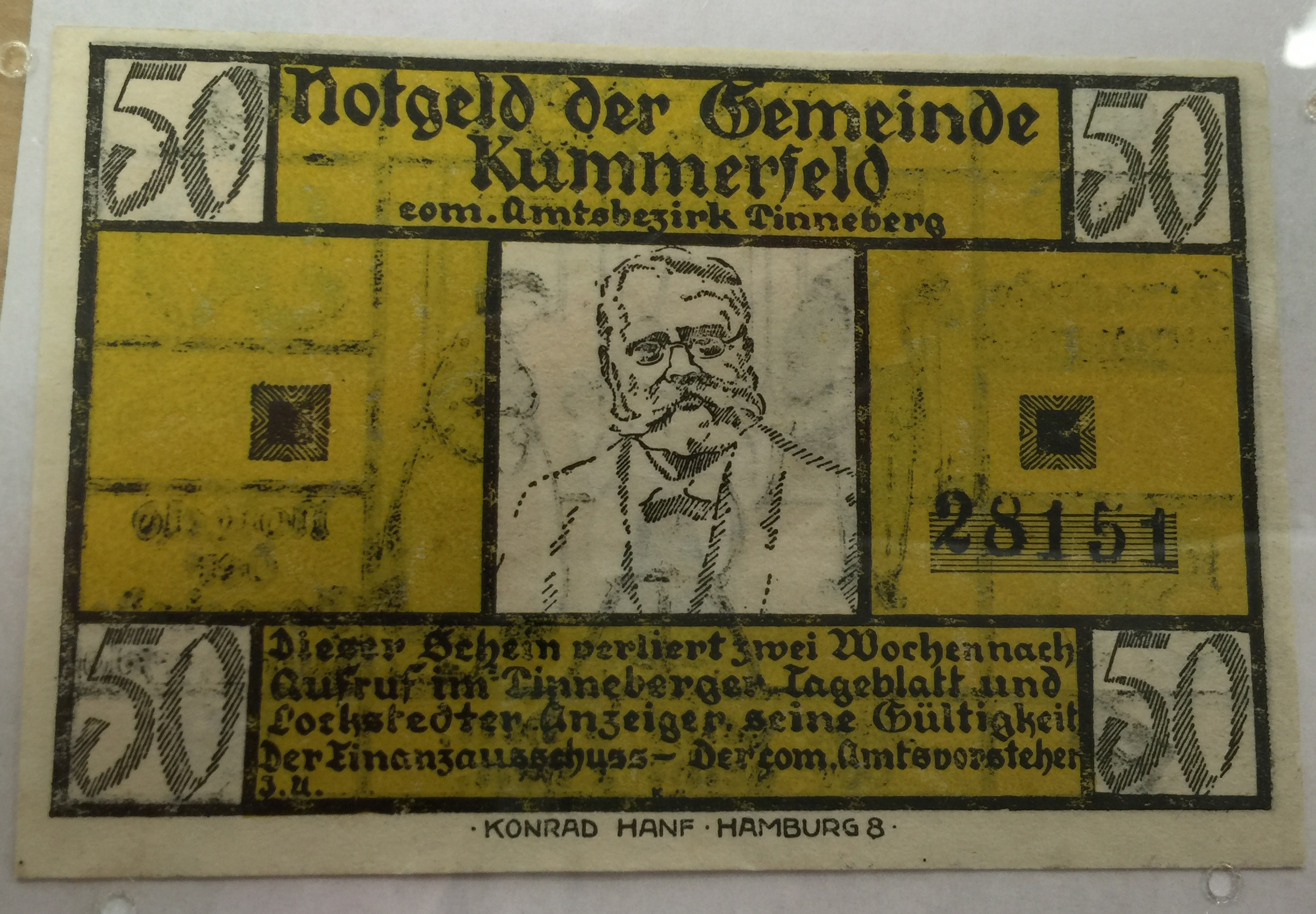
Front Side

German Colorful Money
Donated by Ed Carver
MASC in Holland-Terrell Libraries
Back Side
The currency example I chose to analyze was from part of the Ed Carver, German Colorful Money collection. This money is from around 1900’s and was used primarily around the Black Forest. The imagery is composed of different icons and illustrations. In the back there is an illustration of what seems to be different situational scenarios. It is hard to say exactly what is going on but you can gather that it is every day scenes of perhaps life in the Black Forest. There are also icons that look like they contain: a grey heart, a black looking domino shape, and two shapes that look like rings.
The color of the bills I got to see is very bright and colorful, he images I took do not do justice to the bright yellow that the bills come in. The bill contains a scheme of yellow, black, grey, white, and a tint of newspaper brown. The colors could have picked because of its bright hues and the great black contrast against it. The typography looks like it is an old school english font. It is very bold and hard to read. The language on the bill looks like it is German but when I google translated a word it detected Maltese.
References and associations that these designs elements have are that they look like old confederate money. It also has a similarity with the headshot of a man something that US American money has. The bill also has cereal number some kind of tracking system and the US money has this same association. These are different from the ones I historically and culturally grew up with because the person on the bill is not in our US history therefore I do not know who he is and what he was known for.
Lastly the continuity between he front and the back side of the bills can be seen in the color scheme hat is so predominant. The other thing that ties it together is the typography that is seen on both sides of the bill. One last connection to note would the the layout of the bill, it is formed by lines that create different size squares and rectangles that give the bill consistency.
