
http://www.underconsideration.com/brandnew/archives/new_logo_and_identity_for_australian_olympic_committee.php#disqus_thread
This logo has to do with the Australian Olympics Committee. They wanted a more simple logo.
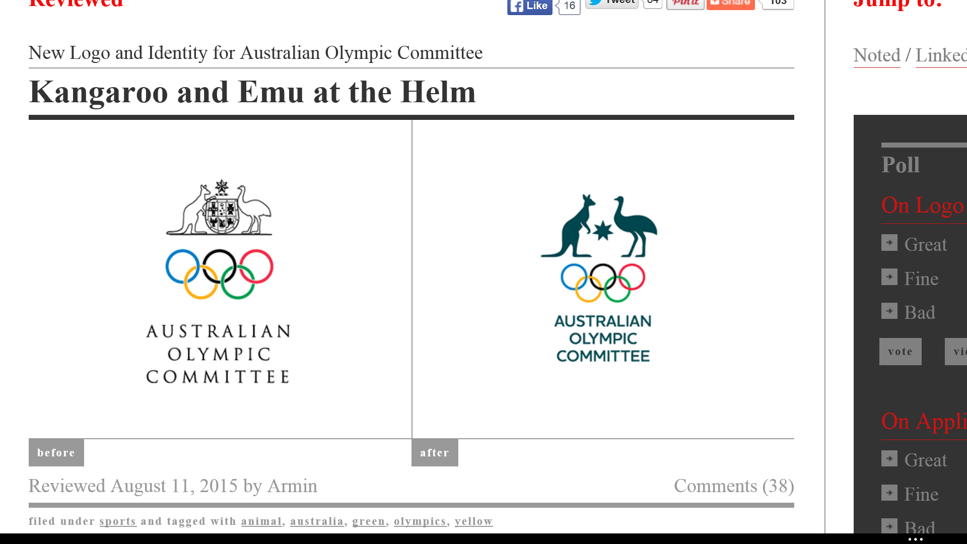
The previous logo for the Australian Olympic Committee was more geometric than the present one. The reason is because the previous one has the traditional old shield in the middle of the kangaroo and Ostrich. The crest is a representation of man made object. It also has rectangle in the shield that are consider geometric. The star on top of the shield would also be geometric but the shading of the black on one side of the star make it seem three dimensional. The kangaroo and Ostrich are both Icons in the past logo because its structural similarity with the object signifies a kangaroo and bird. Next the circles that make the Olympic logo are both geometric and organic since its can be associated to natural objects like the sun. The new design I would still consider geometric because of the star in the middle of animals yet the color green make it feel more organic even if its still using the same icon designs. I would have to say that both logos are representational than abstract because the image is clean and visible to what they are. The kangaroo and the bird are more known to be located in Australia and I would consider them a styling option and semiology option because it a sign of Australia. I know when I think of kangaroo , Australia is one of my next thoughts. The Olympic circles would be another styling option but I would lean more towards a semiology design. I think the designer decided to change the logo to have a more clean and cut logo. I feel like the previous logo with the crest was a little to much and busy. The company stands for a team that can represent Australia. It wants a more quick simple yet strong design for its competitors and its committee. The previous logo used a more geometric type of writing style because it has more sharp corners than the current logo. The current logo still has feel of geometric but its writing style is a bit more organic because the letters have a slight curve to them.
