
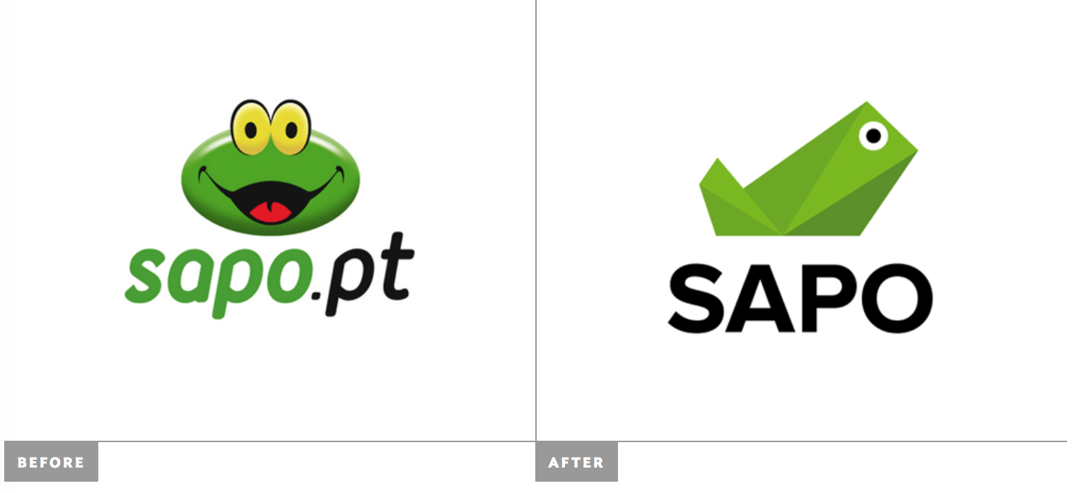
Logo redesign and rebrand for Sapo, a search engine/news portal. The logo was most likely designed in-house, according to the side underconsideration.com under Brand New. It was meant to embody the company’s values: modern, technological, innovative, and disruptive. .http://www.underconsideration.com/brandnew/archives/new_logo_for_sapo.php#.VgyHPrQy-kY
This logo underwent a huge transition from organic to geometric, while still being representational of a frog. It is obviously key to keep the logo a representation of a frog, as it is considered the mascot or symbol of the company. “Sapo” can be translated into “toad” in Portuguese.
The logo can be considered geometric because it is largely made up of triangles and other angular shapes. As the reading says, “a shape can be considered geometric in nature if its contour is regularized – if its external measurements are mathematically similar in multiple directions… angular or hard-edged.”
The design can be considered representational because it actually looks like a frog. The outline mimics that of a frog sitting, and the circles inside of the outline represent an eye. The color scheme is even green, as frogs often are, making it look even more like a frog. This image is highly mediated, representing not only a frog in itself, but also the company which it belongs to.
I would assume that the designer made their choices when creating this logo to bring the logo into modern style, as well upholding the values of the company it represents: modernness, technologic , innovation, and disruption. The new logo indeed upholds these principles, in that it looks more modern and technologically new, as well as showing extreme innovation in changing the whole style of the logo.
