
Invented in the early 1980s by Lonnie Johnson — a mechanical and nuclear engineer who happened to have helped develop the stealth bomber program and worked for NASA . Now owned by Hasbro, under the Nerf brand.
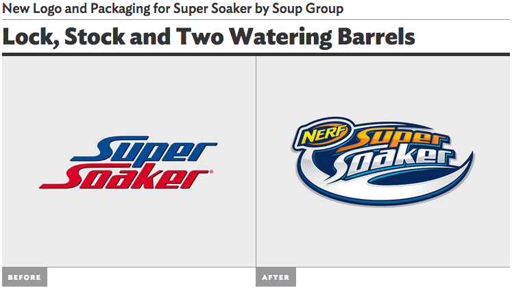
When the Super Soaker came out it was produced from another brand other than Nerf. The logo was simple and I would say organic. The logo was basically the words “Super Soaker” on a basic font. There was nothing to exciting about the logo before that would draw consumer’s attention. The logo is basic to the point where the logo is not displaying what the product is and to be honest, the name doesn’t make it obvious what the product is or does. Super Soaker can be a hose or something for your garden. The logo is symmetrical where the words are on top of each other aligned in the same space.
The new logo was changed nine years later; the new logo has a more geometric design to it. Nerf bought the brand and included their brand logo onto the super soaker design. It was smart that they did that because Nerf was/is very popular and so stamping their logo just reintroduced the Super Soaker to their audience. The new logo includes a geometric shape, don’t know exactly what is but it ties the whole design together to make a cohesive logo. The shape adds a direction to the text so it could be read from left to right in such as curvilinear style. Also the color that they use makes it come together with the orange font color that ties it in with Nerf. Most Nerf products have orange in the product or the accessories. Overall it is a better and improved from their old one.
