
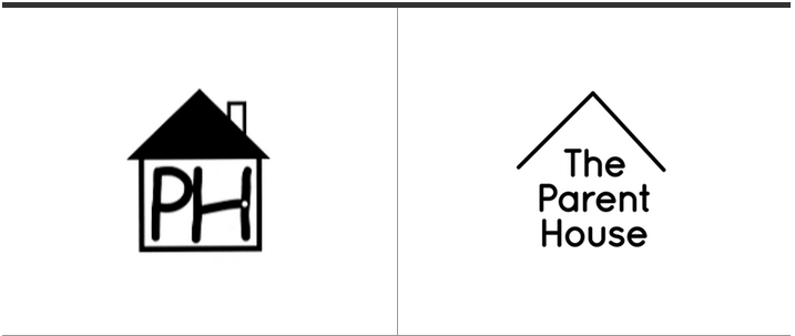
This is The parent House logo by Brand Union who provide low income housing.
The reason I chose Parent House was because i really liked the change they made. Going from the dark house to the simple roof over the brand name i thought worked really well. I really agreed with the way they took out the geometric shapes of the house and put in the organic roof. i think it lets the readers eyes and imagination really take over and you still see a house its just not actually there. They wanted the walls on the house to be gone to show that anyone with low income can still afford a house. The new logo is both representation and abstract as it represents a house by just having an abstract roof. The brand itself went from PH which i would have no idea what it was if i walked up and saw it. To “The Parent House” is nice soft letters that are easy to read and really catch your eyes. By only having a roof shows the houses main purpose more as well. It shows they always have a roof over their head to provide shelter its a very simple design change that i think works really well in catching the eye and putting their point across. In my opinion it is very mediated as they are trying to say they are a safe company by providing a roof over their logo if you choose them then they will do the same for you and someone could easily argue that point. In my opinion this logo is aesthetically pleasing and i think they really succeed in what they were trying to do.
