
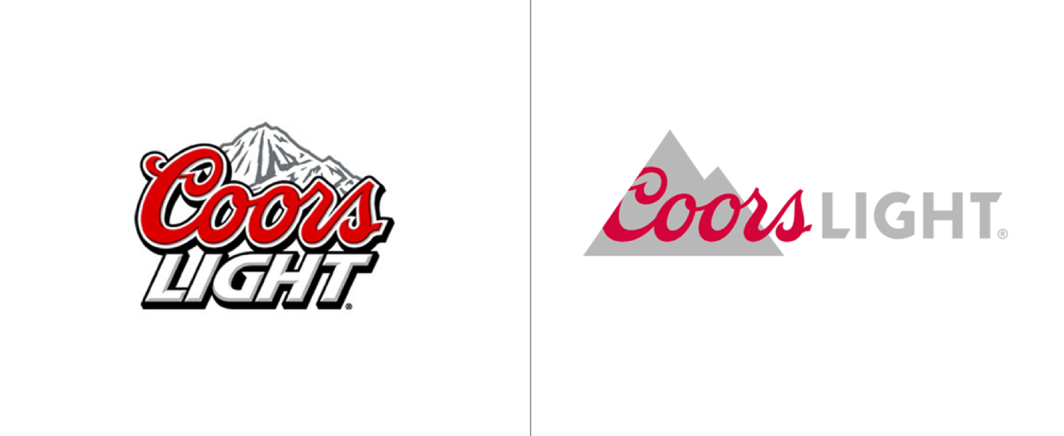
“A Lighter Light Beer” by Turner Duckworth. Turner Duckworth’s overall purpose of this new and improved Coors Light logo was to take it and give it a cleaner, simplified look and feel, all while still providing a playful and classic Coors Light design.
As a graphic designer, my motto is “make it simple yet significant.” For that reason I chose to analyze the remake of this Coors Light logo designed by Turner Duckworth.
When browsing through the “Brand New Blog” this piece of work stood out to me the most because of the amount of simplicity and significance that it held and quite frankly, I believe that if I were given the opportunity to redesign the Coors Light logo I would probably go for something similar to Turner Duckworth’s work.
I found the older logo to be more organic with a sense of still being somewhat geometric. The older logo tends to hold a lot more detail that can be seen in the design of the mountain, the outlining of the text, and the shadowing of the text. I felt that the mountain in the older logo gave off a slightly geometric feel because of the overall outline of the mountain but the amount of detail that it holds I believe gives it a more organic look.
The new logo is a more geometric representation of the older design. Specifically when looking at the simplicity in the shape of the mountain. You can see that Turner took the detail out of the mountain and gave it or a more 2 dimensional feel where as with the older logo the designer tried giving the mountain a more 3 dimensional feel. Looking at the new design, I wouldn’t necessarily say that it’s abstract due to the fact that the mountain still looks like a mountain; it’s just more simplified.
The new design gives off a very modern feel. The mountain and text have been simplified but in a way where you still find the overall aesthetic of the logo appealing. All in all I can appreciate the work that Turner Duckworth put forth, I believe that he took simplicity, significance and modernization and created a great piece of art.
