
I chose to analyze the Little Hope for the Hop logo. The before image features a geometric shape because it is an image of a flower or lily pad. This image is regularized and represents reality, therefore it is representational. The image achieves balance through the line down the middle and there is an equal scale of elements on each side. The before logo is simple and ordinary and I would not remember it if I saw it.
The after logo is much more unique. It contains an organic image on the left side that draws the viewer to the left of the logo. The image is an abstract symbol that is related to movement because there is a light blue ball. The ball seems to be moving past the orange line in an abnormal, bouncy way. The designer created an image that represents movement because it is promoting a transportation company.
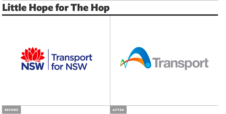
The word, “Transport” is in grey letters in a classic, slightly bubbly font. I think the designer wanted the word to stand out secondary to the symbol, which is why it is a contrasting color with the color of the symbol. The symbol is bright colors including blue, orange, and green because the designer wants the viewer to look at that first. The symbol is organic and irregular, which is why the logo is more memorable than the first one. It also has an updated, futuristic feel to it because of the bright colors and simplicity.
