
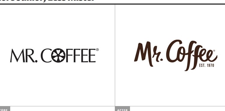
Mr. Coffee logo before and after
I chose the Mr. Coffee logos from the Brand New blog. Mr. Coffee was founded in 1972, and the typeface chosen for the original logo is representative of this era. The O is a representative of what is possibly a coffee filter, but I am not completely positive. For that reason I will say this shape is abstracted.
I liked this logo because we have been discussing type face a lot in class, and what it means to view typefaces as more than simply letters. The original typeface is more geometric as it is square and even, whereas the new logo is more organic as it twists and turns and isn’t consistent throughout (i.e. the two f’s are different and the two e’s are different). The new typeface almost reminds me of the steam arising from a cup of hot coffee, or maybe even coffee dripping down the side of the mug in the way the two f’s hang below the rest of the word, so for that reason I will argue that the new logo is somewhat representational, but as the reading stated more often than not, an object will be a mix of representational and abstract.
My understanding is that if an image is altered a lot from it’s original state, then it is highly mediated, and if it remains similar to it’s original state then it is less mediated. On that I could be wrong though. However, I have two arguments for how mediated the image is. Firstly, the new logo is not mediated in the sense that the letters are still highly representative of letters. Secondly, I would argue that the new logo is somewhat mediated in the sense that I mentioned earlier it is somewhat representational of steam or dripping coffee, but it’s not exactly these things – it has been mediated to look more like a typeface.
