
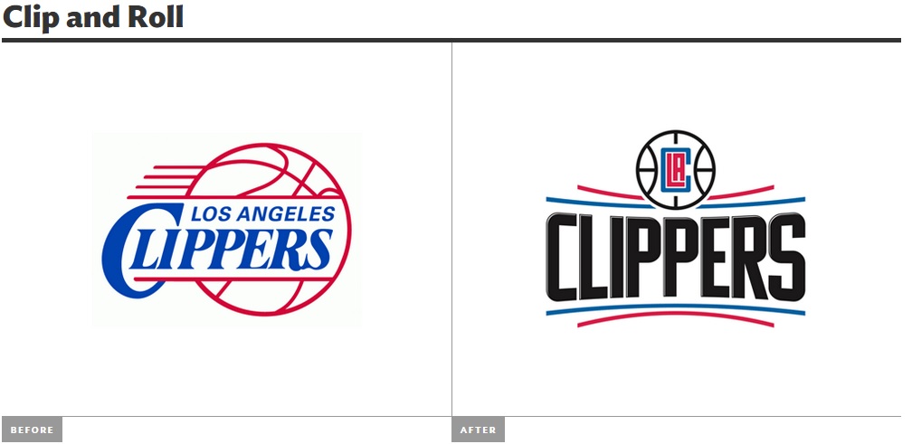
The Clippers logo before and after. The artist of the new logo is unknown.
The two logos that I have chosen are the before and after logos of the Los Angeles Clippers. I would say that the older logo is more organic compared to the newer one. This is because a lot of how the typography and the basket ball sort of flows and isn’t as rigid as the updated version. The new updated logo doesn’t have as many curves as the older logo. The design of the basketball is very clear in both logos as they both represent teams in the NBA. The new logo has a different representation within its logo however. The LAC inside the basketball of the new logo is supposed to represent the Clippers wrapping themselves around LA, symbolizing that they are the team of LA. The two blue lines in the newer logo are also supposed to represent waves as to hearken back to the nautical days of the team. The designer chose all these elements in order to bring together many things that represent the Clippers and have it in one logo. I believe that the new logo is mediated since it looks nothing like the old logo. The only thing the two logos share are a basketball, the word Clippers and the colors red and blue. Everything else is different from the font, placement of the basketball and even the typeface that is used to spell out Clippers.
