
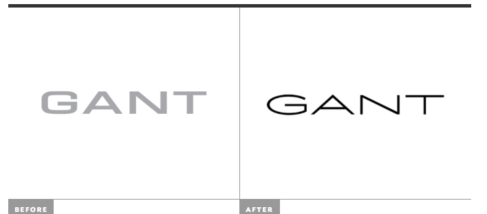
Gant’s new identity was designed by Stockholm-based Essen International. After all the success from the late 20th century, Gant entered the 21st century with a more mature customer base. This brought opportunity to Gant to rejuvenate the brand.
http://www.underconsideration.com/brandnew/archives/new_logo_and_identity_for_gant_by_essen_international.php#.VgzfvLSprzI
The Gant logo has a very geometric foundation to it, this allows the design to look very clean and noticeable. It is very easy to tell that the shape is geometric because of it’s inorganic form. The letters also look legalized and human made because there are not many instances where nature can form these shapes . The contrast between the color of the font and background on both, the before and after logo makes it almost look three dimensional. This piece is more representational because the word “GANT” is made out of letters therefore it represents letters. In contrast to abstract where everything is pertaining to lines, colors and sometimes represent a narrative. I believe the author did this to make the image very clear and legible for it’s audience. This could be supported through the amount of negative space around the word “GANT,” because it allows its audience to clearly read the the word. Additionally, the authors preference of using geometric shaped instead of organic could be because of its neatness and simplicity. Whereas, an organic shape may be harder to identify because of its irregular shapes. Furthermore, because the company strives for being clean, simple and luxurious the logo compliments their goal very well. The logo can also to be said to have a low level of mediation hence, it is not very realistic.
