
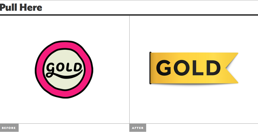
Organic: The logo on the right is more organic because of the hand drawn feel of the image. The edges are soft and the lines are all curved and yet are not perfect. When I look at the logo on the left it feels unprofessional or cheap in comparison to the logo on the right.
Geometric: The logo on the left is a lot more geometric in comparison to the older logo. The ribbon and text both have many straight edges and angles that add a cleaner feel to the logo. The gold ribbon and the clean lettering give off the impression that the company is interested in quality.
Abstraction: Both of these logos seem abstract in the sense that they don’t give me any idea of what the company is about. The shapes however themselves are easy to recognize and give the impression of an award winning company.
Representation: When you think about a ribbon the shape on the left only makes sense when the gold gradient on it. The added shading helps the eye recognize the shape as a bending ribbon rather than just a rectangle with a triangle missing.
Relation to the Company: These logos both don’t give me any idea about what this “Gold” company does. They are too simple to offer even a hint of what the company does. The logos are both easy to look at and clearly state the name of the brand but with out any context we cannot figure out the meaning behind the logo.
