
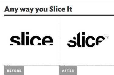
This advertisement was created by designer San Francisco for the brand, Slice. Slice is a brand that sells kitchen equipment. The goal for changing the logo was to create a more playful, simplistic, and sharp design to better reflect the modern ideals of the company.
Slice is a modern, sleek contemporary brand that sells kitchen products, and most predominately equipment for slicing/cutting . The old and new logo strongly represents the product in a geometric form by giving the viewer contour within the logo itself. The contour is the most powerful aspect of the both designs; In the first design, the contour is geometrically square. Although the logo is cut in horizontally, creating an interesting visual, the words appear rectangular, straight, and not very static, creating a sense of stablity. The newly designed logo gives a more dynamic and static appearance. This is created simply by changing from the rectangular shape to what appears to be more triangular where it is cut off. The triangle shape creates more active movement and involvement with the visual aspect of the logo, which gives the logo power to draw individuals in. When looking at the logo it is still apparent that a rectangle/square was used to cut off the words and the new logo has the triangle shape used. As it was supported by the reading, the logo is both abstract and representational, however, I would say this logo would be deemed as more representational. The new and the old logo have the word “SLICE” which is strong enough to the represent the company that sells mainly cutting equipment; it is a very concrete word that everyone understands the meaning of it. It further supported that this logo is representational within the design when being “sliced” linearly or diagonally. I believe that the design would be able to have a sense of being abstract if the brand had a name that was not so concrete allowing the cutting design to be abstract in suggesting that the company sells cutting products. Due to the form the logo is presented (printed on paper of products) and the intents of having a sharp/clean/modern design, the designer used the medium of digital technology. This medium created a logo that is a literal representation of the company and therefore the design is not mediated. Any viewer will be able to look at the logo and understand that it is called “Slice” and the design is sliced in correlation. The designer has not created any personal artistic illustration of what the logo stands for that one would what the logo means
