
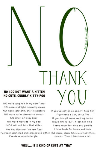
Broadside made by Shannon; I found this poster on the media file. I thought we had to choose something from there. I tried to find its source but I couldn’t. There is a link to another post for this but it was made in 2014. I looked that other student didn’t have a link either.
The word No is made at a bigger SCALE than everything else in the poster which caught my eye making it a focal POINT. Since the word “no” is bigger it BALANCES the rest of the small PLANES on the poster. My eye than read the authors name on the side of the letter which was created on a vertical LINE. The placement of the authors name was clever since we read from left to right our eyes will end at the letter O where the authors name was placed. The words “no thank you” are green which get an emphasis of color. After, I look down vertically right to the words Thank you. They are the second biggest word ( they used the SCALE again) on the poster which grab my attention. After the BOLD titles to the left and the bottom center are emphasized. The titles were created to be LINES. At last, I pay attention to PLANES which are separated in three paragraphs. The first paragraph is distinguished by the side lines being even until a small LINE starts the second PLANE. After the second PLANE starts with the smallest sentences and spread from small to big back to being small. The third PLANE is at the right below the word “you” which stay sort of even from both side of the paragraphs. A weird separation in my view would be the LINE that got created between PLANE 2 and PLANE 3. It goes from one side of the page to the other.
