
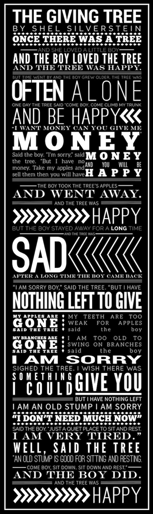
Lauren Turner’s Broadside: The Giving Tree
This text is very heartwarming and thought provoking. There is a simple yet complex story being told of a lifelong friendship built on helping one another. The tree helps the boy and the boy makes the tree happy by taking what it has to offer. The mood has a somberness about it as well as a pleasant gentleness. This feeling is not only conveyed by the text itself, but is also shown through the way the text is represented.
Visually, this broadside draws a person in right away. Hierarchy is present throughout the whole broadside. Not a single area lacks hierarchy of some sort. A person first sees certain words like “sad,” “money,” “often,” and “give you.” These words would lead a person to believe that they are more significant to the composition than the rest of the words. These words make a person want to know what is so important about them and why they are more significant than the words set in smaller type. Once a person steps closer they realize that all of the text goes together to tell one story and the words are not just randomly placed. This draws in the viewer and makes them want to read through the whole broadside to piece all of it together. The larger text is usually statements or parts of the story that seem very important or pointed while the smaller text is the filler part of the story that tells details of what is going on. The hierarchy does seem random in some cases but it makes it visually engaging from far away and draws the viewer in very quickly.
All of the type styles seem appropriate for the broadside and keep the reader engaged. Because of the style of this broadside, there is no real division between the running text and the display level text. There are obvious words that seem to stand out as display level but are included as part of the running text to be read along with the text chosen to be smaller. All in all the broadside is easy to read, some text uses very thin type that can be a little more difficult to read at certain angles, but does not distract from the piece as a whole. The amount of words per line is very reasonable and does not make the reader feel like it is dragging on. Some chunks of text are confusing to piece together where they go in the story but do not stump the reader for long. If the running text were all one size and style and the title all one size and style, the broadside would not be nearly as engaging and the viewer would not want to read the whole piece. Overall the display and running text levels seem appropriate throughout.
The spacing throughout the text all seems very thought out. There are portions of text that the kerning appears to be very tight while other areas it is quite loose, or just right, but in all of these cases there seems to be some purpose behind her choice to change the kerning. The leading also varies in the same way as the kerning, but it does not hinder ones ability to read through the text easily. The alignment of all the different typefaces and sizes looks very planned out so that it could all fit within the box restricting the text. Because of this, there are areas where the text appears in paragraphs and others where one word takes up a whole line. All of this adds to the visual aesthetic and draw of the piece. It seems very purposeful.
Keeping all of the text and negative space black and white keeps the piece cohesive and shows the viewer that it is all one piece of work. This color scheme also adds to the mood stated above. Everything seems balanced with all of the different sizes of text throughout. If the broadside were not as large as it is, it would not have the same effect and readability. Making it this large was definitely a key decision. The lamination does make it somewhat difficult to read in certain lighting, but does not hinder the feel of the broadside in its entirety. All in all, this broadside is very strong.
