
Amy Koller’s Broadside PDF
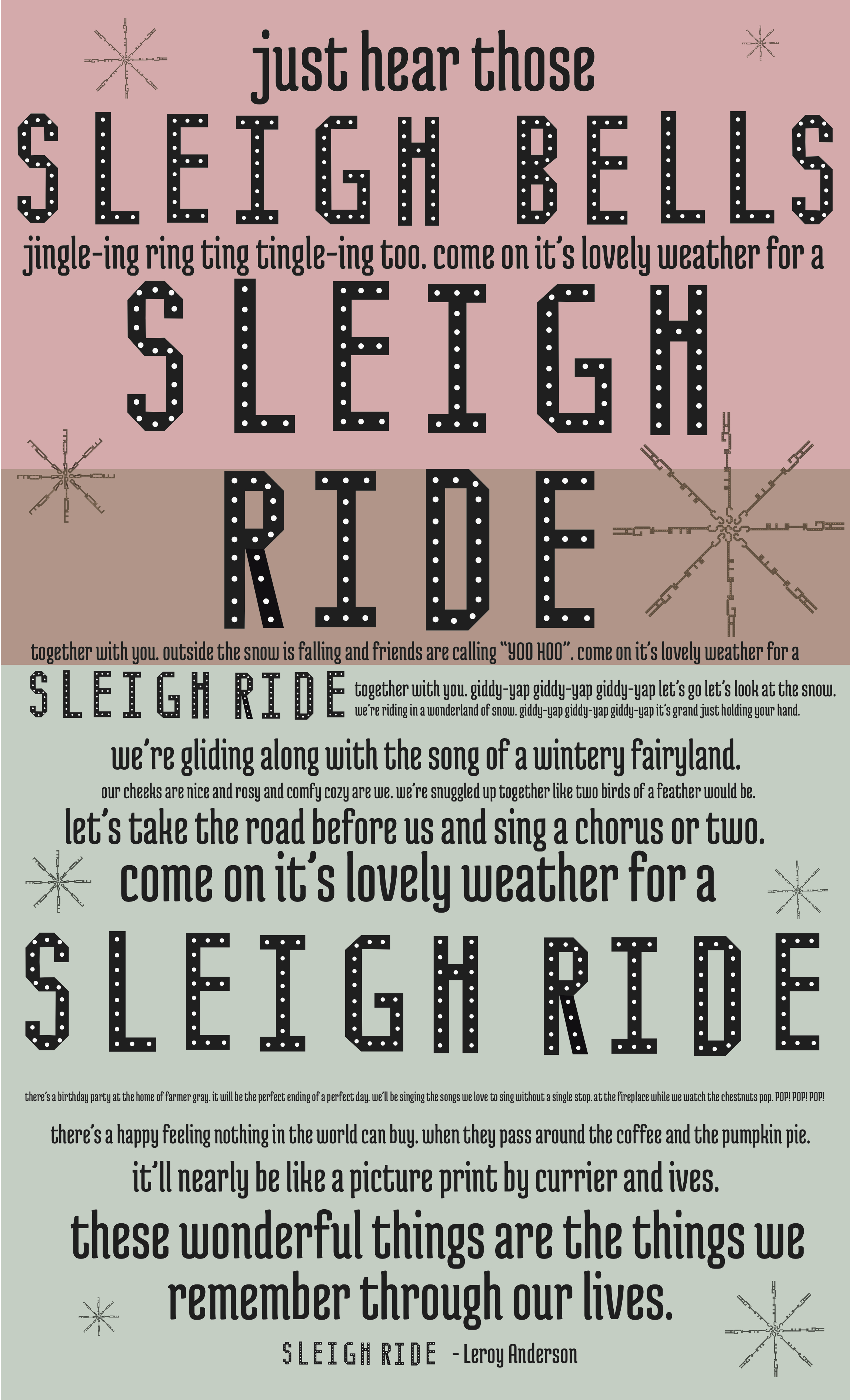
The broadside that I was chosen to critique is Amy Koller’s of the song “Sleigh Ride”. At first glance, the broadside is very visually appealing and balanced. All of the text is centered throughout and feels organized. The words “sleigh bells” and “sleigh ride” are written in Amy’s designed font, which I feel was very successful. Amy’s typeface is the one that sticks out the most to me and gives the broadside a sense of identity. Having the typeface all capital letters helps capture attention as well and makes the broadside work from a distance. The letter spacing in “sleigh ride” is somewhat large which helps it work as display level text. There is one other typeface used for the rest of the poster and I think it does a great job of complimenting the designed font. The size of type varies much throughout the poster, and it seems to go from small to large, leading up to “sleigh ride”. As you read through the broadside from top to bottom, the different font sizes seem to work well with the song. Sleigh ride is written five times on the poster and each time is at a different size or position. This pattern gives the broadside a sense of unity. The second largest text pieces are “come on it’s lovely weather for a” and “these wonderful things are the things we remember through our lives”. These might be second in hierarchical order because they are important parts of the song that add a lot of feeling and therefore should be easy to read. Line spacing feels fairly normal throughout, but some lines are closer together than others. I wonder if the designer did this on purpose or if everything is supposed to be even.
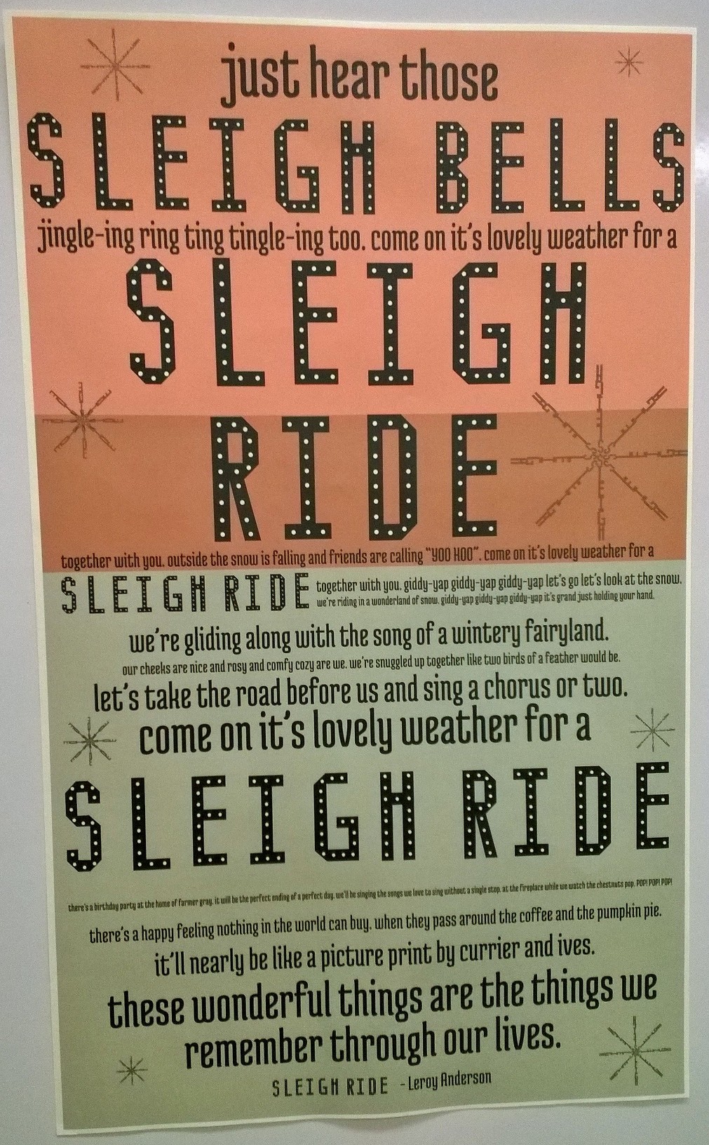
Photo of Broadside on Ivory Paper
There are two colors used in the broadside and they seem to be translucent red and green. Then there is a rectangle in the middle where they overlap and make a brown-ish color. The brown color somewhat encompasses the word “RIDE” and makes it stand out more. When the actual broadside was printed on ivory paper, the red color turns into more of an orange, which slightly confuses the Christmas color scheme. I am not sure that faded colors are the best choice for such a cheery subject and maybe she could use a more saturated red so that it still appears red on ivory paper. I do enjoy the choice of ivory paper because it adds an old-timey Christmas feel to the song as opposed to being printed on clean white paper. There are also subtle snowflake designs along the sides of the poster, filling in space and keeping things balanced. I think the snowflakes do a great job of contributing to the theme as well as concluding the overall design. The type seems to be carefully chosen and arranged in order to embody the spirit of the text. Without the snowflake designs, a similar message would get across, but the snowflakes make it more obviously holiday related. Overall, Amy uses a sort of typographic poetry to capture the essence of “Sleigh Ride” and I think she did a wonderful job.
