
Food Broadside
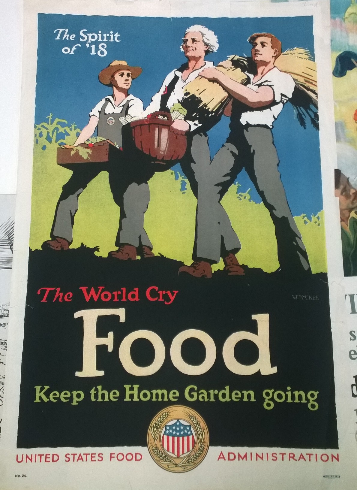
One of the broadsides that captured my attention most while browsing through the MASC Collection was this, a broadside related to food. When categorizing this broadside, I wasn’t quite sure if it was Integrating Display Type, where the display type is so prominent and striking that there is no need for any additional imagery, or if it was Integrating Images where overlaps and intersections between text and image are beautiful when examined in detail. The word “Food” is obviously the largest and most eye-catching piece of the poster, but the image is successfully integrated as well. This broadside uses simple yet effective colors that properly capture the essence of the message. The word food is written white on a black background which creates a high contrast that draws our eye in. Then, the words, “The World Cry” are written in red, perhaps to convey a dramatic, passionate feel. And under that, “Keep the Home Garden Going”, is written in green, a fitting color for plant-related issues. Below the text, there is a United States Food Administration badge which looks like an official seal of approval. Above this text, the illustration uses a blue and green background further emphasizing the environment, and then sticks to neutral colors like grey and brown for the people. The people look like strong, stereotypical American men. Their general posture looks important and inspiring. The words “The Spirit of ’18” are written in white against the blue sky in the top left corner. This serves the purpose of contributing a patriotic, unified feel to the broadside. There is only one typeface used throughout, but the word “The” is always written in italic. The display type is almost so effective that you need nothing else, but the other words and images integrated together create a feeling of completeness in the poster. Using few and simple colors, the artist was able to effectively make parts of the broadside stand out that needed to stand out. The overall design of this poster is extremely inviting and eye-catching. The use of typeface, color, and design placement all contribute the success of the broadside.
